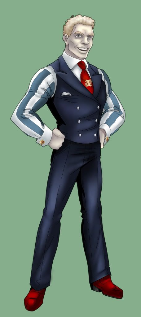
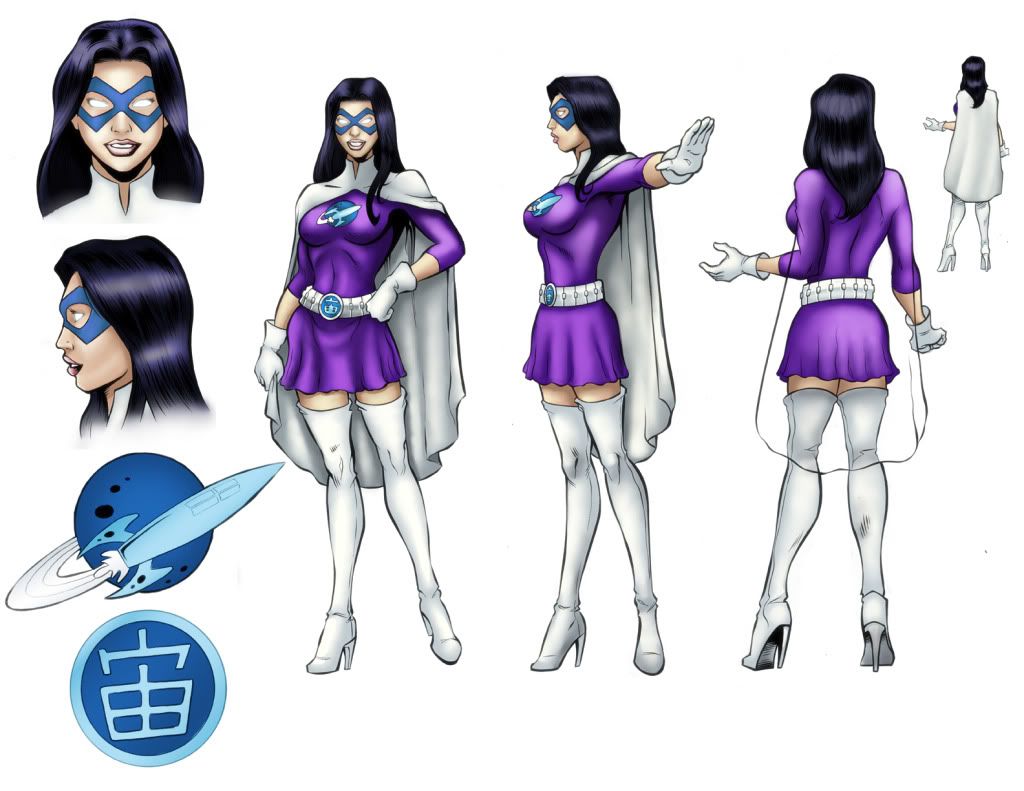
Adventures in color!
You are flexing some real solid and different techniques Eddy! Wonderful job on all of them!
[url=http://starwindgraphics.deviantart.com/]My deviantArt page[/url]
[IMG]http://img.photobucket.com/albums/v292/AceFrankly/Starwind-Name-Signature1.gif[/IMG]
Proud member of The Impossibles/Pinnacle -[url="http://www.theimpossibles.org"]www.theimpossibles.org[/url]


been a bit slow in keeping this place updated with new pieces.


Already told Eddy this when I first saw the colored version of the art Wassy did of Fenian but I just want to say again - He does an absolutely fantastic job of adapting his colors to the line artists style.
When I was first asking him to do my Tim Kelly pieces (above a bit) I was worried how they would turn out - not because I didn't have faith in Eddy but because TK's style is kind of unique and just any old coloring job (even a good one) could easily erase that uniqueness... Once I saw Eddy's colors on the first one though, all fears were eased...
Now, once again, I think Eddy did a fabulous job of coloring another artists work while maintaining the style and uniqueness of that artist.
Bravo Mr Swan! 
Great job on the latest batch Eddy. 
I agree with Caemgen it's great to see this stuff in color but I can still tell easily tell that's a Wassy piece (wooden duck and all  )... you are adding to the works without overpowering the original style.
Nice.
Those are all very good, Eddy! I love the coloring on the fairy the most!! 
~*~VexXxa~*~
The City Scoop Art Correspondent/Writer "ART IS IN THE EYE OF THE BEHOLDER"//"Don't hate because VexXxa is HOT and you're NOT." - JOHNNYKAT
Great work you're putting up here, Eddy!
Great crop of work amigo! You have great versatility!
[url=http://starwindgraphics.deviantart.com/]My deviantArt page[/url]
[IMG]http://img.photobucket.com/albums/v292/AceFrankly/Starwind-Name-Signature1.gif[/IMG]
Proud member of The Impossibles/Pinnacle -[url="http://www.theimpossibles.org"]www.theimpossibles.org[/url]


Getting busy this weekend with commissions. (goes back to work)


Some recent commissions.
Look who the Soul Kitten dragged in. 
Nice work on these man, good range of color and I see you fixed up some stuff too (removed the cut line from Bayani's piece, made Alpha's neck mechanical like it should be etc etc)... the colors are even a bit more vibrant than your norm. Cool stuff Eddy. 
Only things I might suggest (just a preference thing) is to color the pages/debris blowing around in Caemgen's scene... even if it's a light color like yellow or amber just so the only white is the background. A white piece of something on a white background with only a black outline looks like it got overlooked.
Also the codpiece on Alpha... with the inner side of his right thigh being dark and a heavy drop shadow (from the torso) over his left thigh I don't see how there can be "top-lighting" striking his crotch in between them. If there was another light source it would have to be from a side or below and so a different part of the surface should be white. I am no expert on metallics though so by all means correct me if you see it differently.
P.S. Just noticed Bayani's piece got flipped horizontally too... is this a correction because he is left handed?
YEAH!!! It's EDDYYYYY!!!! I LOVE THE COLORZZZ!!! 
~*~VexXxa~*~
The City Scoop Art Correspondent/Writer "ART IS IN THE EYE OF THE BEHOLDER"//"Don't hate because VexXxa is HOT and you're NOT." - JOHNNYKAT
How the heck did I manage to lose track of this thread? 
Oh well. Niiiiice. 
"If I had Force powers, vacuum or not my cape/clothes/hair would always be blowing in the Dramatic Wind." - Tenzhi
Characters
|
Look who the Soul Kitten dragged in.
 Nice work on these man, good range of color and I see you fixed up some stuff too (removed the cut line from Bayani's piece, made Alpha's neck mechanical like it should be etc etc)... the colors are even a bit more vibrant than your norm. Cool stuff Eddy.  Only things I might suggest (just a preference thing) is to color the pages/debris blowing around in Caemgen's scene... even if it's a light color like yellow or amber just so the only white is the background. A white piece of something on a white background with only a black outline looks like it got overlooked. Also the codpiece on Alpha... with the inner side of his right thigh being dark and a heavy drop shadow (from the torso) over his left thigh I don't see how there can be "top-lighting" striking his crotch in between them. If there was another light source it would have to be from a side or below and so a different part of the surface should be white. I am no expert on metallics though so by all means correct me if you see it differently. P.S. Just noticed Bayani's piece got flipped horizontally too... is this a correction because he is left handed? |
|
Oooh, oooh, I know this one! It's flipped because of the little model sheet/character profile book Bayani is working up. Works better with the formatting if it's flipped around.
|

yeah, I get what your saying with the codpiece, but there is alot more flexibility with shiny so I dont think it looks too odd. and I did add a slight bit of color to the paper, but it must not have been an active layer when I saved the jpeg for web.
and....
New Stuff!

Thats right... JIM LEE woot

Great job, Mr. Eddy!
(*huggle pounces Soul Kitten ... because he looks like he could use it!*)

AMERIKATT: Star of Stage, Screen, and Saturday morning cartoons! (Art by Psygon and ChristopherRobin)
"(Katt-Girl) obviously reads a lot of encyclopedias" -- Kiken
Dark_Respite's video -- Avatar: COH Style!
I Support Nerd Flirting and Even More Nerd Flirting!


Superb work!
My Deviant Art page link-link
CoH/V Fan Videos