ArtRage and Lady Judgement
By
Bill Z Bubba,
Posted on: 2008-11-09 21:43 in Multi-Media Fan Creations
Nifty galifty. Was that hard to do?
The Alt Alphabet ~ OPC: Other People's Characters ~ Terrific Screenshots of Cool ~ Superhero Fiction
OMGOMGOMGOMGOMGOMGOMG!!!!
*fanboy moment coming on*
Youdaman BW!!!! I loves it... can't wait to see more!
LJ
Looks great! 

Don't need one that simulates natural media, what I need is a program that can simulate actual talent. 
That is pretty nice. Can't wait to see colored images you can make with it.
FireBrandi - Champions lvl 50 Fire/Fire/Fire Blaster - Tier 4 Alpha
Kim Paler - lvl 50 Crab Spider - Tier 3 Alpha
My DA page
[ QUOTE ]
Don't need one that simulates natural media, what I need is a program that can simulate actual talent.
[/ QUOTE ]
I've been waiting for this as well.
/returns to lurking in jealousy at the work around here
Be well, people of CoH.
that looks hot BW! cool pose and equipment and all. Cant' wait to see when this is finished
MA Arcs - #67636, #92202
deviantart page
Slag Heap: Why you hurt Guardian!? Guardian no hurt you!
Nice sketch and looks like a neat tool (I'm in the same boat needing a 'talent' slider on the programs I use ). What's the cause of the two horizontal bands at the bottom of the image (the first is only noticable on the glove, the second runs all the way across)?
Thanks for all the replies, guys.
In response to Ironik's question about difficulty--a problem I've always had doing comic book influenced art relates to line quality. I always end up drawing things with these scratchy little lines, the way I would do brush strokes when painting. That doesn't fly too well for comic art or anime.
A workflow that helps me is first of all working fairly large, at least 8.5" x 11" at 300dpi. Your lines will always look better when done large and then reduced. The other thing is using a very light, fine line. So when I sketched this, I just kept drawing over my mistakes and darkening the things that looked good. So if i decide to ink it, I can put a white fill layer over it that will wash out the crappy lines and leave the darker contours, which I would then ink over and refine.
Blacklisted
"I'AM SATANS FAVORITE CHILD!!"

[ QUOTE ]
What's the cause of the two horizontal bands at the bottom of the image (the first is only noticable on the glove, the second runs all the way across)?
[/ QUOTE ]
I didn't have a plan for this pic, I just started doodling. So originally she was placed lower and farther to the left on the page (if you look you can see where some of the hair on the left is cut off). I moved and scaled the image to the right and drew more of her legs in at the bottom. The banding is the cutoff from the sketch prior to being shifted.
Blacklisted
"I'AM SATANS FAVORITE CHILD!!"
I really like the look and the lines...love the hair especially. Lovely!
Busting heads since 1938
Character references * My DeviantArt gallery * I am an altoholic
Here's a progress pic
Generally, when I start to color something I will lay down a background tone over the whole picture. This is to unify the piece colorwise (so that the foreground and background elements look like they're part of the same environment). It's also to make the forground elements pop, so since LJ's costume is red and yellow, I used a desaturated greenish tone. All of this my eventually get painted over, but the green will inform and bleed into everything that comes after.
Blacklisted
"I'AM SATANS FAVORITE CHILD!!"
[ QUOTE ]
[ QUOTE ]
What's the cause of the two horizontal bands at the bottom of the image (the first is only noticable on the glove, the second runs all the way across)?
[/ QUOTE ]
I didn't have a plan for this pic, I just started doodling. So originally she was placed lower and farther to the left on the page (if you look you can see where some of the hair on the left is cut off). I moved and scaled the image to the right and drew more of her legs in at the bottom. The banding is the cutoff from the sketch prior to being shifted.
[/ QUOTE ]
Makes sense . I was hoping the program didn't cause that for some odd reason.
Fatal error: Uncaught mysqli_sql_exception: You have an error in your SQL syntax; check the manual that corresponds to your MariaDB server version for the right syntax to use near 's Assassin'' at line 1 in /var/www/vhosts/cityofheroes.dev/forumarchive.cityofheroes.dev/topic.php:262 Stack trace: #0 /var/www/vhosts/cityofheroes.dev/forumarchive.cityofheroes.dev/topic.php(262): mysqli->query() #1 {main} thrown in /var/www/vhosts/cityofheroes.dev/forumarchive.cityofheroes.dev/topic.php on line 262
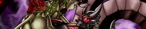
Hey all,
I know a lot of people who frequent these boards are newcomers to digital art, or are interested in learning how to create art on the computer.
I recently bought a digital paint program called ArtRage2, by Ambient Design . This is a program that simulates natural media, along the lines of Painter, but it's very affordable. I'm just starting to use it, but it has a lot of the features that I use constantly when doing my stuff and the price really can't be beat.
Anyway, in order to test it out, I sketched a picture of LJ using the pencil feature. I will update the wip in this thread as I experiment with the other tools while refining the image. Hope ya like.
Blacklisted
"I'AM SATANS FAVORITE CHILD!!"