
Clutch
-
Posts
81 -
Joined
-
Quote:Nicely done!Originally Posted by Eddy_Swan


Well, nicely done to everyone, really. This is an interesting contest (and topic), and it's cool to see what people are coming up with
Now excuse me, I must get back to my lurking -
That was bloody fantastic

<3 My Fair Lady -
Quote:Yes, but with limited successOriginally Posted by the_fox_Rox
You do astrophotography too?!? I started some of that in highschool but since i've moved to college I haven't been able too. My basic equipment yielded some pretty basic results which was kinda disappointing. Maybe when I get to have my midlife crisis I'll be able to do that again.

I've had a few fairly decent planetary, lunar, and solar images, but deep sky objects are not really possible due to tremendous light pollution in my area, aside from very bright ones like M42. My equipment is pretty modest by astrophotography standards.
Here is a recent image of Mars I took


(M42 nebula in Orion)
I also got a nice one of a lunar eclipse progression in my DA gallery. -
Thanks!
I'm not happy with the left (his right) hand just kinda hanging out there and not doing anything, but I'm just gonna move on. -
Okay I think I'll go with this:

-
Cripes.. I'm trying all different types of reflections but now that you said googly eyes, that's all I can see

Maybe I'll just let it sit over night.
Right now it's time to sit outside in the 7 degree cold with a vodka martini and take pictures of Mars -
Quote:My good ol' DockersOriginally Posted by ChristopherRobin
..and the tread pattern on his boot looks strangely familiar

(mainly cuz I spent all day yesterday looking at it while drawing my first of 40 heh). The left one, to be exact.
Yeah, I agree the goggles need a better treatment...I'll have to see what I can do. Originally I was going to do a reflection, but it's too small of a feature for that effect to work. -

...because I hate the CoT -
Feel free to take a look through my work (links in my sig)
-
Happy holidays to you all

I'm glad that I came to the CoH art forum and rebooted my DA account. The fan forum over at CO was killing me - it was like shouting into a void. Honestly, if I were stranded on a desert island and had no one to show my artwork to, I'd probably just stop altogether. The feedback I've been getting between CoH and DA is really helping to keep me going, and I am very thankful for that! -
Quote:Thank you.. I'm still trying to find my voice so to speak, but it's getting there.Originally Posted by VexXxa
I truly love your style, Clutch!!!
")
-
Took out the gory bits... We'll just call it a figure study

-
on second thought, I'm going to censor myself and just say that there is some new art up that contains violence which may not be for the faint of heart.. I did put a mature warning on the DA upload to restrict it to 18+
-
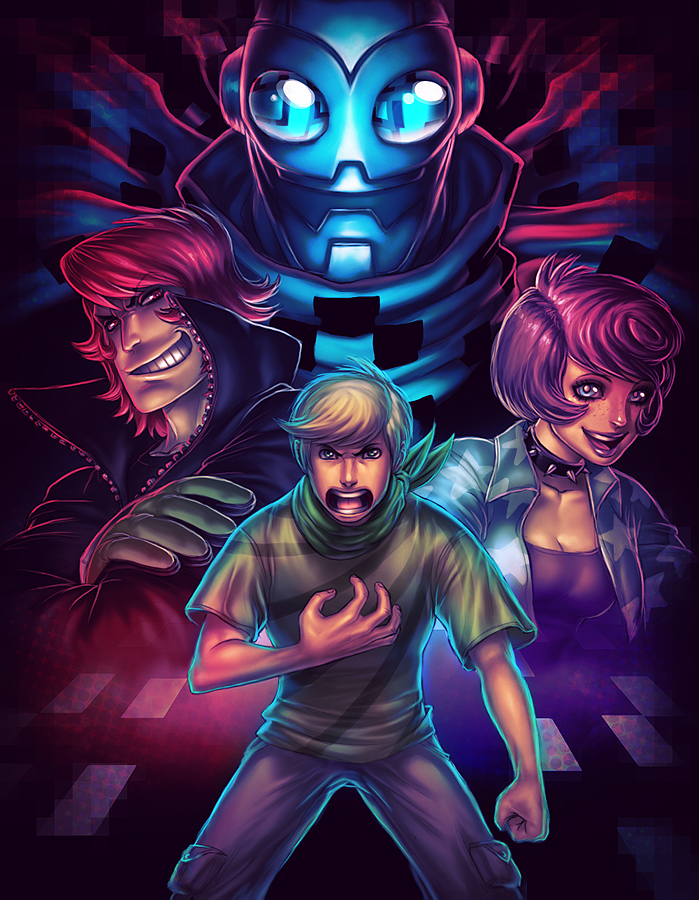
Quote:Brilliant! That's a fantastic composition

-
Quote:Brilliant work
-
Thanks for the warm welcome, everyone
Quote:I eat catgirls. It fuels my rage.Originally Posted by Power_Play
OMG, great artz!
Welcome to Virtue. Please don't feed the catgirls unless you want them to never leave you alone.
I'm trying to learn it, actually. Emphasis on "trying". The cyrillic alphabet is a hard adjustment. Typing is really hard, I'm thinking of getting those clear key overlays for one of my keyboards to help out.Quote:Originally Posted by Genia
Is there a specific reason for your Russian inclinations? Inquiring minds want to know. -
Quote:that's painfully adorableOriginally Posted by Deebs

-
Quote:Actually I'm looking forward to having new pieces to replace those withOriginally Posted by BubblegumBomb
Holy crap! Clutch, you arent even showing us the good stuff from your DA! Which is an understatment becuse even this stuff is really good stuff!
http://www.brianthieme.com/2d_galler...allery/3889846
http://www.brianthieme.com/2d_galler...allery/2545919
http://www.brianthieme.com/2d_galler...allery/2586856
http://brthieme.deviantart.com/art/Mary-146045608
Well, the one titled "Mary" is Ok, but the others I don't care for... I feel like I stepped up my game quite a bit since I made those, I just need some new pieces (like the one I'm doing now) to show it. I really don't like how the face turned out in Ozryel, the entire pose of Midnight's Shadow is nutty (his head, especially, is off), and the sketch...well, the sketch is salvageable, but I'm not sure that I should bother. I have a problem with going back and reworking older pieces, I have to learn to just let it go.
I still like the two portraits in there (Rehka Sharma and the random girl that I pulled out of the tubes via google) but since I worked from a photo reference I don't put much stock in them. Those pieces were more about practicing with color and value anyways. -
Quote:Disciple is better. I am, and will forever be, a student of art.Originally Posted by EmperorSteele
Oy oy, welcome wayward disiple of the arts!
...Nah, nix that. MASTER of the arts =) -
Quote:In that case I better get back to workOriginally Posted by the_fox_Rox
These are really nice. You are quickly jumping to the top of my favorite artist list.


Actually I think I need to stop here for the day... I started rendering her extended leg and boot before realizing that most of it is going to be covered up by a shield (that's what those two fingers are going to be poised on) That means it's time to stop.
....anyways, the is character design is from a friend, she's kind of the villainous version of Ms. Liberty...and, for what I have planned with the rest of the image, it's probably going to end up being one of the more gruesome and violent pieces that I've done in a long time. -
What?
Just dropping in to say hi. Coming over from Champions, I think I'm going to nest on Virtue since I found some people to play with over in the fanart forum
I also make pictures.
So yeah, hi
-
Quote:This. A million times this.Originally Posted by Jophiel
I personally don't give a dead rat about SG/VG bases. I'm mainly in it for the company.
I jumped on virtue to join the Rogues Gallery since I hadn't settled on any server.
Base or not, I'm just looking for company. Coming from Champions...well, if it weren't for the subscription and the random zone chatter, I'd swear it was a single player game. -
Fact: Beautiful people get treated better. Yeah it's cruel and unfair, but there it is.
Still, there's too much awesome in the world, and I'm afraid that if I were stupid, I wouldn't be able to appreciate it.
Smart and ugly wins. -
Soul Train has the right idea. I haven't used PSP in years, but it should work something like this:
Duplicate/copy your line art to a new layer and rename it something useful like "Line Art". Set its blending mode to "Multiply". In this mode, all white areas of the layer will be, effectively, transparent, and all black areas will be opaque (without getting too technical, it uses the values of your line art layer to multiplay against the layers below it).
Do your coloring on a layer underneath your Line Art. This is pretty much the staple of digital inking and coloring.
Another way to color (although this is more of a "painter" technique) is to prepare a greyscale image that has all of your lines and shading, and do your coloring on a separate layer above, also set to multiply. painters such as Rembrandt used a technique like this, building up thin color washes over a monochromatic base layer (known as a grisaille). Using a multiply layer will require that you start off using lighter color values since they will darken over the image underneath. You can also try setting the blending mode to "Color" and experiment with that. This technique is good for many people because most find it easier to get your values (lights and darks) down in greyscale than it is in full color. -
Just messing around today...
This is from a pretty well known photograph of Audrey Hepburn. I think I butchered it pretty good

Actually last night I discovered Adam Hughes and his Hepburn-esque Cat Woman. Well, being the consummate Audrey-addict that I am (yeah I know it's pretty much cliche to love Audrey Hepburn, so what), I had to give it a shot. Of course I failed, but not terribly. Mr. Hughes though...damn that guy completely captured her essence without making it look identical...
and he nailed it
every.
single.
time.
I mean, who ever gave a $%&@! about Cat Woman? Well not me, at least. Yet I'm going through all of the Hughes Cat Woman covers thinking "man I gotta buy these!". Well-played, Mr. Hughes. Well-played.
Anyways, what I -really- wanted to do was to try a more comic like style...and I failed there too "inking" and coloring is a lot harder that I figured...I was fighting with my painter side the whole time. Ah well... I can't expect great results on a first try. I almost feel like I'd have to break out that archaic pen and paper stuff to get good results. The Cintiq is a great tablet, but no tablet can reproduce the texture and sense of friction that you get with a pen/pencil against paper.
