Personal Comics
The only suggestion I have is that your character really needs to be in some sort of action pose, or battle. Something needs to convey your character's personality, and at the same time make people say, "Ooooh!".
1st - Wanted Comics Love it! Great, catchy name for a comic brand. I like the skull, too.
2nd - The correctional facility, though impressively drawn, looks from a different era.
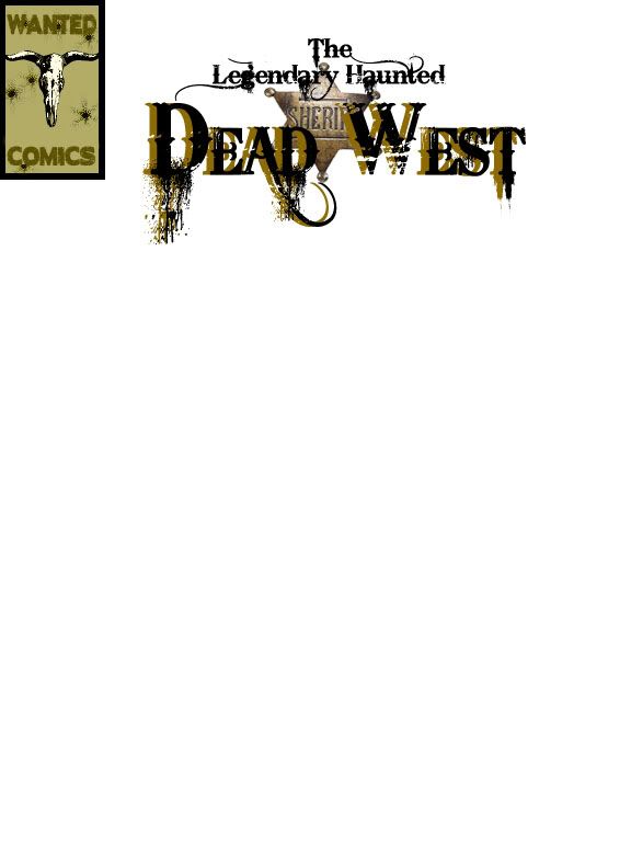
3rd - The title - I like the ...font, I guess the word is, but the ...."drippage" is too distracting for my tastes.
Not sure what kind of character the toons have, but understand that the bandana was typically only worn to either rob a bank or something, or in a dust storm. The scenes look too clear for a dust storm.
The 3rd template, for me, the sheriff's star is crowding the title.
Lastly, I can't recall the last time I bought a comic book. But, I think the volume and issue information should be present in the upper right corner, if for no other reason, then you can ensure that none of the letters in the title get chopped at the publishers.
Please keep at it, because it's clear to me you have some talent!
"Most people that have no idea what they are doing have no idea that they don't know what they are doing." - John Cleese
@Ukase
How about a barcode in the bottom left hand corner?
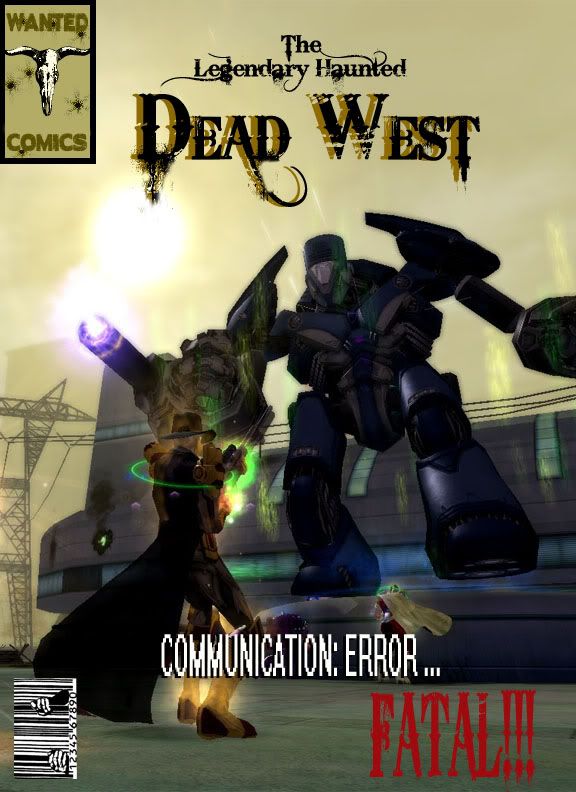
Definitely an action sequence would be great to give the awe-some factor.
I really think incorporating the sheriff medallion into the title somehow would be great, too me it's seeming crowded and as well, the D's fuzzy dripping looks odd. I like it, but it's odd.
Great tho, can't wait to see more.  I have some for Tax E Girl. hehehe Anyways, enough about me... I wanna see more!

@Tax E - RIP CoH 2012
That is mostly what I was thinking, though to clear something up Ukase, I didnt draw that, its a screen lol.
I need to take more action shots of Dead in his new outfit, I was just using those to warm up. I wish I could move that title closer together but photoshop was being testy. But yeah I will add the issue info when I actually come up with a story. Might have to turn to the boys for help on that.
And as far as the bandit mask goes, well if he wasnt wearing it the children he saves would have nightmares for 4 generations.
Ok so revamped it a lil today.
United Powers of Paragon
"Hope is the last thing a person does before giving up."
-Henry Rollins
www.theirongategallery.com/ (They will do custom costumes if you ask really really nice)
Of all of the covers, I like the last one the best. I agree that the action shot is really what makes it. Call it the "money shot" if you will. As far as the title goes, I like it, but the secondary color is a bit distracting. Almost makes me want to grab for some 3D glasses. I would try to stick more towards a solo color, or something that's along the lines of the CoH title at the top of the forums. Not necessarily that style, but if you want the title to pop, that would be a better way to go about it.
I like the USB code you put in there. That's a great touch with the hands behind the bars. If you really want to nitpick, then the volume number, issue number, and price would all need to be under the "Wanted Comics" logo, but for now, not a big necessity.
The screen shot is a very fitting one for DW based on his background. Sure, it's not the old west, but the sky color definitely fits. Besides, since DW's been around for a day or two, fighting War Walkers isn't too much of a stretch.
That's my two cents. Looks good though and I can't wait to see more.
A veteran is someone who, at one point in their life, wrote a blank check made payable to 'The United States of America' for an amount of 'up to, and including, my life'.
Visit Amarillo
Check out my arcs: MA# 494947, "Operation: RISING STORM", MA# 407176, "I Got Your Mothership Right Here!"
That is awesome Dead!!
I love the bar code! The "FATAL!!!" is too eye catching... I would make it the same font as the rest of your communications: error... and a different colour, but OMG the rest looks amazing! Price, issue and date... can be done without as this can be a special edition... ohhh special edition! hehehe
Great stuff, I wanna see more! 

@Tax E - RIP CoH 2012
Holy smoking guns, Geronimo! I never even saw the hands gripping the bars!
DW, that's good stuff. Don't you dare put this stuff solely in the art section, 'cause I'd never see it there. Typically, I might say something like, "Meh, interesting. Let's see what foolishness is going on in the global channel thread." But, I'm not even thinking about that when there's cool stuff like this to see. Please keep it up!
"Most people that have no idea what they are doing have no idea that they don't know what they are doing." - John Cleese
@Ukase
I'm enjoying the artwork, DW. Let's see more!
|
Holy smoking guns, Geronimo! I never even saw the hands gripping the bars!
|

Now where did all the grass go that used to be outside??
A veteran is someone who, at one point in their life, wrote a blank check made payable to 'The United States of America' for an amount of 'up to, and including, my life'.
Visit Amarillo
Check out my arcs: MA# 494947, "Operation: RISING STORM", MA# 407176, "I Got Your Mothership Right Here!"
|
That's why the government has spent thousands of dollars to train me Ukase. Gotta have those sharp eyes in my line of work.
 Now where did all the grass go that used to be outside?? |
Sgt.: Private! Do you have any college under your belt, brain?!!
Me(PFC): Why, yes. Yes I do.
Sgt.: Well, get a freakin' refund!
I was always 11 up and 3 down. :P
"Most people that have no idea what they are doing have no idea that they don't know what they are doing." - John Cleese
@Ukase
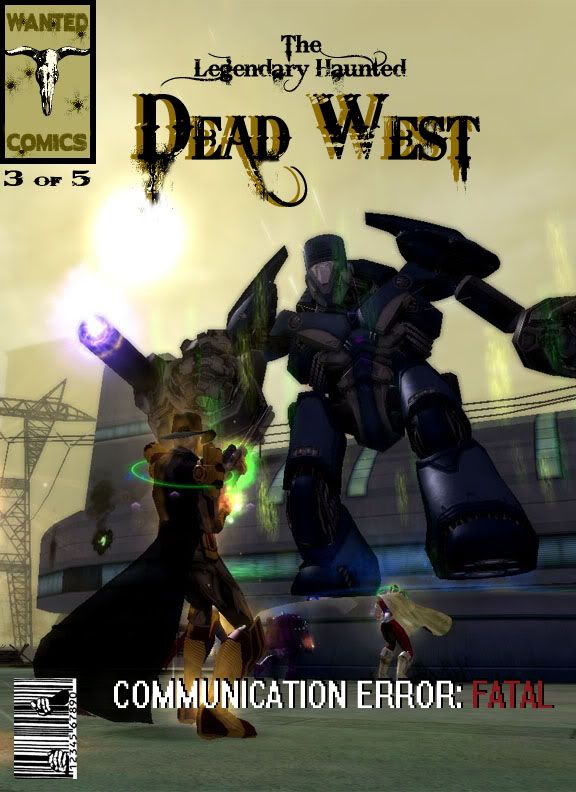
I keep going back and forth on a few things but the nest issue will be the finished product
United Powers of Paragon
"Hope is the last thing a person does before giving up."
-Henry Rollins
www.theirongategallery.com/ (They will do custom costumes if you ask really really nice)
So was browsing and look what I found, my favorite DW making some great covers.
Okay very old school here as you already know DW. My thoughts on the sherrif badge is it could be used in place of A in DEAD WEST with the letter font outline over the badge. Not sure how that would look withthe extended part, just an idea. Like the action scene vs the warbot. Which generated a few ideas to throw at you  for action scenes.
I completely understand about the bandit mask and wish they would give us a neckerchief bandana for around the neck not just covering the face. Of course I also want a dual rig gunbelt, but thats just me 
Awesome Job DW And I'm inspired to run an ITF more on that somewhere else. Hope to catch you tonight.
AV
|
by Star Ranger 4 WIN LOSE OR DRAW, WE WILL FIGHT. WE ARE HEROES This is what we DO! |
Decide that this will be another day in which you Walk The Talk.

MA #14724 Operation: Discredit @American Valor
Sentinel Of Liberty SG

Now I know that these should probably go in the art section but wanted to share with you guys first and get your opinion.
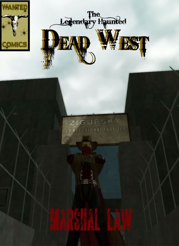
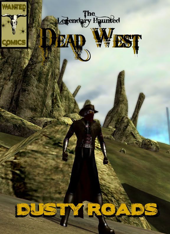
Working on some new comic covers and made a couple already. Now I don't have the content of the comic yet but just give me your best constructive criticism on these. Seriously, don't hold back.
Now this was a different template that I was thinking about but I almost think that its too much.
United Powers of Paragon
"Hope is the last thing a person does before giving up."
-Henry Rollins
www.theirongategallery.com/ (They will do custom costumes if you ask really really nice)