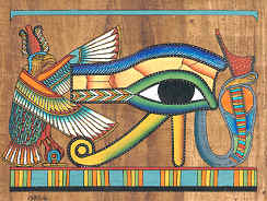
The Eye of Horus!
it's known as BOTH Horus and Rah!

Sweet image! I hope you have a good tat-person.
[url=http://starwindgraphics.deviantart.com/]My deviantArt page[/url]
[IMG]http://img.photobucket.com/albums/v292/AceFrankly/Starwind-Name-Signature1.gif[/IMG]
Proud member of The Impossibles/Pinnacle -[url="http://www.theimpossibles.org"]www.theimpossibles.org[/url]
here is the last one I had finished
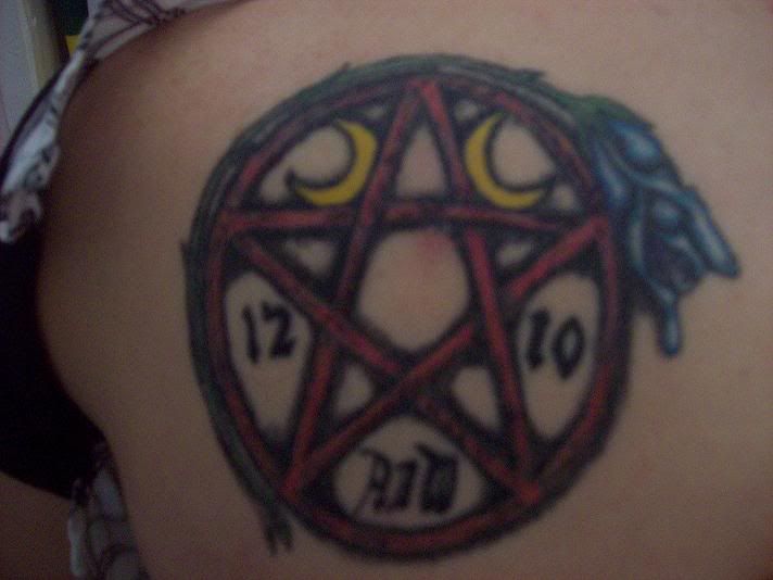
Shouldn't it be gold and blue like it's Egyptian nature... and hey that last tat had red, now you have to go to Carousel... RENEW! RENEW!! RENEW!!!
Quote:
how do you think I found my allergy ?!?!? |
Originally Posted by LadyJudgement

Shouldn't it be gold and blue like it's Egyptian nature... and hey that last tat had red
|

I agree some gold and blue to go along with the egyptian theme. However I would sprinkle in a tiny bit of green. I'm no good with deciding where (EnnVee should know by how my costumes sometimes turn out  ) but I'll see if these pictures help at all.

P.S. EnnVee your previous tat looks amazing. maybe someday if something means that much to me I'll get one, but I need some serious thought to put into it.
P.P.S. *insert sarcastic semi RPing here* It's seems sweet that this pair of Isis and Osiris are doing something special to commemorate their little she-Horus.
ok since i suck trying to use paint to edit, and it's all I have, I made a paint by color scheme for it.
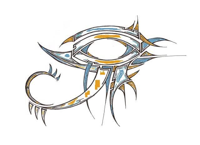
If ANYONE can use this guide and perhaps make a better looking final image I would be so thankful for the help. just a heads up, I want to keep ALL the black lines from the original even those i covered in my crappy paint edit
I would honestly suggest you get it colored professionally. Eddy Swan could probably bang it out in no time, otherwise there are colorists on DA that work for $10 or even less and they do great stuff.
Ok, lines probably aren't as crisp as they were and the colors may not be exactly right but at least this should give you an idea of what it would look like colored as you indicated...

If I had some talent and/or a Wacom maybe I could have saved the highlight black lines but I just don't have the ability to even give it a good attempt with my mouse. 
And just because I like green...


Caemgen, those look great !!!! I can't wait to get this done, I may even keep the green!!
Quote:
|
Originally Posted by EnnVee
Caemgen, those look great !!!! I can't wait to get this done, I may even keep the green!!
|

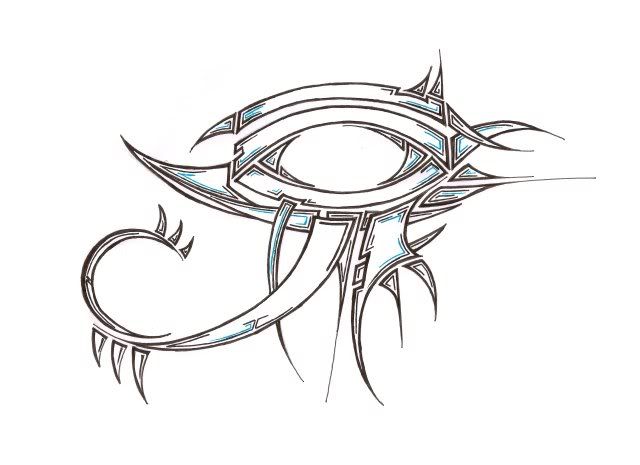
Eh, it's alright. It would definitely look better with clean, sharp lines and with the black excent marks inside the colors coming through properly... But it was no big deal, just enlarged the picture, used Paint (the app that comes with windows) to do the rest... Seems coloring is easy, no matter what Swanzie says!
(Kidding... I kid!)
I do like the little bit of green in it to break up the two colors. According to the pics GK posted it also seems to fit the theme. I'm not sure I would keep it all where I put it though... I just kind of tossed it in quickly without thinking too much of the placement.
I generally hate having anything to do with tattoos, because I don't want the responsibility of having something I did be on someone else forever. But in this case, I don't want the responsibility of *not* doing something to help a possible outcome.
In fleshtone, because that's what you should judge it against.

and with the green

http://www.virtueverse.net/wiki/Massacre_Melanie -the original Fire/Dark Corruptor -
http://boards.cityofheroes.com/showthread.php?t=115217
The Guide to BURN
I'd be jealous that yours looks so much better than mine except I had no idea what I was doing anyway!
Great idea of putting it on flesh tone as well... Now the trick is just to find a tattooist who is really good at mizing colors!
ok, the verdict is in, I showed the two colored pieces to my daughter and she chose the one WITH green so that is what I will get !!
We are most likely getting this done mid to late Feb. so I will post pics as we do it. I plan to do the tat in 2 sittings, but it may take 3. Both Barron and I will be getting this done the same days. Outline, then Color and it takes about 1-2 weeks for the outline to heal completely. Since Barron is getting his version a bit larger than mine and on his ribs his may take longer to heal.
I can't thank Caemgen & Suichiro enough for the color and skin tone effect as this made the choice so easy as for what colors to use in it.
this is going to be my next tattoo. I am putting this on the back of my right shoulder with my daughter's initials and date of birth inside the eye.
If anyone would like to play with some golds and anything NOT RED (I'm allergic to red dye) in it that would be helpful so I can find a nice color scheme to show my tat artist. I tried the other night, but well. . . I suck at it to be honest.
the initials to go in it are P. L. W. and the date of birth is 11-16-01 in case you want to play with fonts and placement.
I hope you all like this as much as I do, but even if you don't I'm still getting it !! LOL also Barron is getting it on his right side rib cage.