Showtime as it progresses
forgot to add my storage area in the lab
|
The base doesn't really follow a theme as a whole, each room has its own.
|
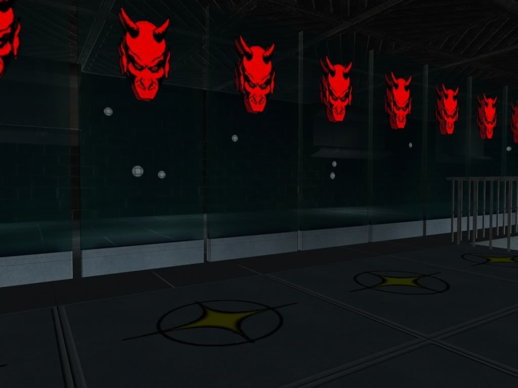
"It was a team effort. Captain Karma designed the medbay, Inferegeneous Ivan did the teleporter room, Supahuman put together the generator room, and Barnacle Bob did the entrance, petting zoo and torture chamber."
|
Entrance A view of the room |
| The TV wall |
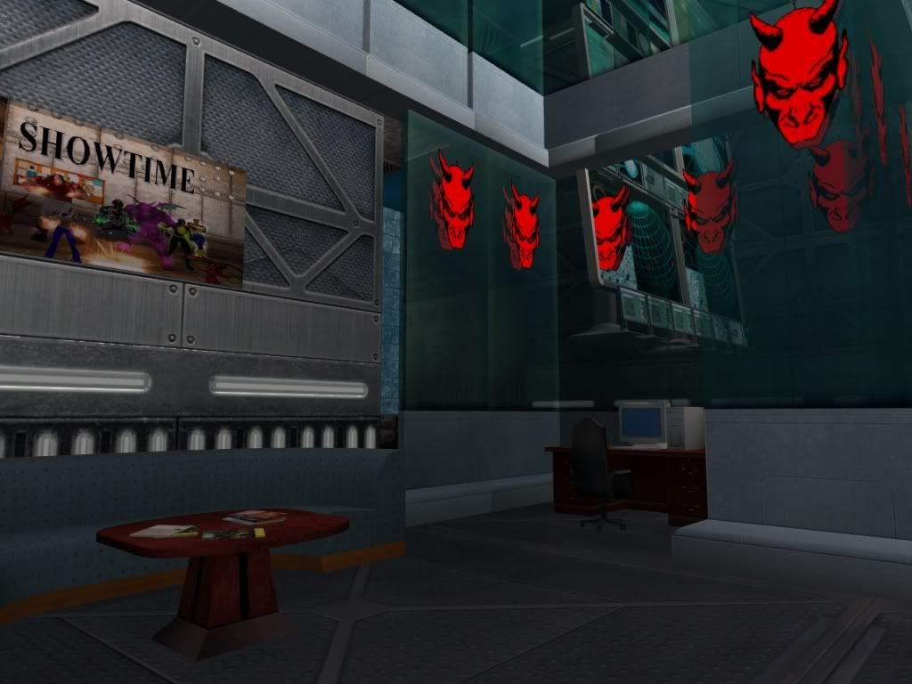
Also I don't like the horizontal overlap of the big monitors... though since you would need to go three wide to evenly match eleven small ones, you clearly don't have room here. How attached are you to the part sticking out that seems to contain only the one desk below and it looks like nothing above? If you got rid of the section sticking out, it looks like there would be room for the extra monitors. If there were a small gap between the monitors, you could fill it with something like one of the power cables from wall details.
| Inside the lower level |
|
Teleporter room This was the next room I did. The theme here is just a general arcane. A view of the room |
| A view from one of the teleporters |
 Hmm, or a stonethrower (I think that's it, head floating over a pillar thing) behind the podium as a 'talking head'.
|
Medbay For my medbay, the goal was to create a simple mini-temple of sorts. A view from the lower level |
| A view from the top |
| Another view from the top. Tried to create a portal in that arch. |
| Inside the "temple" |
|
Workshop This is the room I'm most proud of. It started out as a space center, but it ended up as a lab/observatory A view of the room |
I really like the stairs here. The whole construct puts me in mind of landing gear having extended down out of the ceiling.
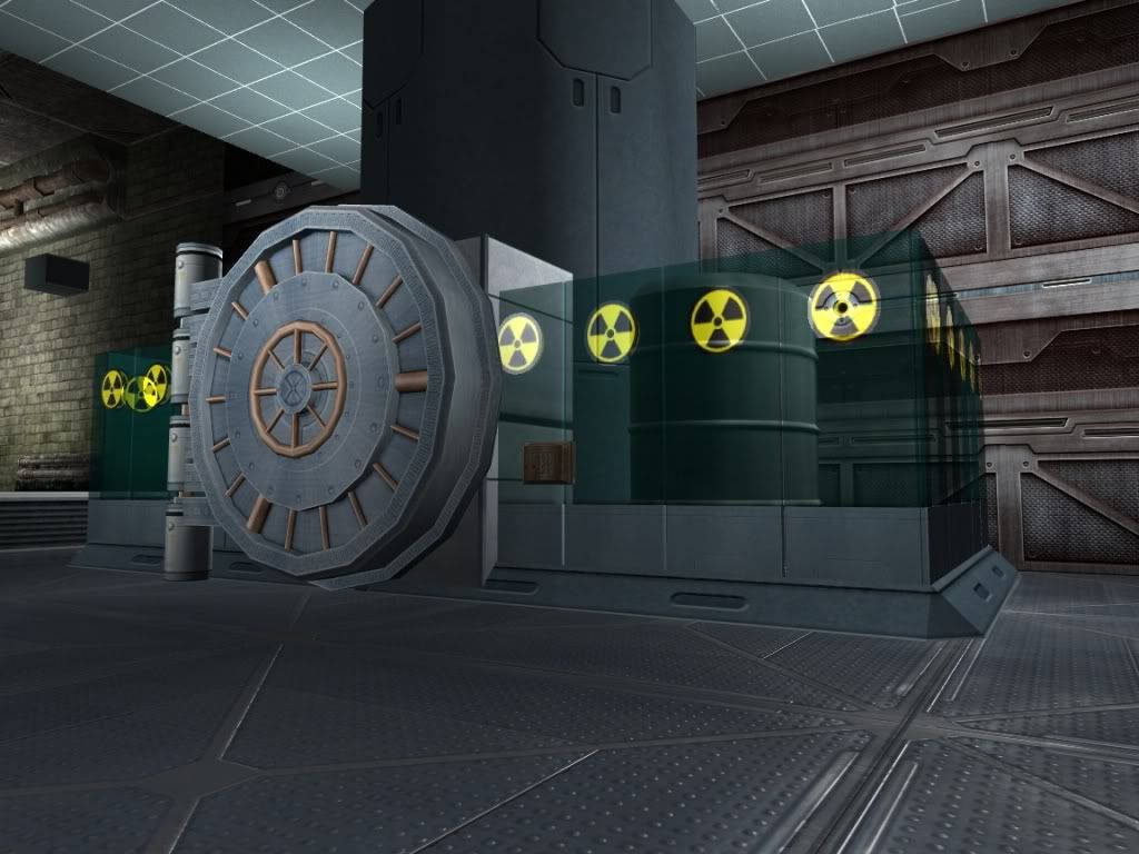
| This was supposed to be a rocket, but it became a radioactive containment unit |
| A shot of most of the viewing area of the observatory(the idea for this was inspired by Turbo_Starr's moonbase) |
| Another view looking out. Isn't that an amazing satellite? |
Thanks for taking the time to go over this. A lot of parts I do agree with you. The glass on the bottom layer did originally line up, but I moved them to fix the clipping. This is the same reason the observatory has spaces. Now that I know how to fix the clipping, I"m going to fix this. Not quite sure what to do with the TV wall, but I think you're right. As for the spike ring, I have no real attachment to it, so its as good as gone. The ceiling tiles definitely need work, I've just been trying so many different ways to fix the clipping. Definitely going to have to try the banners.
Alright, so I've finally gotten around to taking some new screenshots. These are of the pool room "Club Fuz" named after one of our members. Check it out, tell me what you think. (I'll use links this time for convenience.)
http://i183.photobucket.com/albums/x...6-21-31-14.jpg
http://i183.photobucket.com/albums/x...6-21-31-01.jpg
http://i183.photobucket.com/albums/x...6-21-30-55.jpg
http://i183.photobucket.com/albums/x...6-21-30-50.jpg
http://i183.photobucket.com/albums/x...6-21-31-09.jpg
http://i183.photobucket.com/albums/x...6-21-30-44.jpg
http://i183.photobucket.com/albums/x...6-21-30-38.jpg
As always I look forward to any feedback you have. Thanks
Really liked the pool with the wooden floors.
Enjoy your day please.

Hey all. I'm new to base building, and I wanted to show off what I've done so far so I can get feedback. This is the base for Showtime's villainside group on Champion. I have four rooms done, see below, and I'll keep posting new screenshots as the base progresses. The base doesn't really follow a theme as a whole, each room has its own. I would really appreciate any constructive feedback, good or bad.








Thanks and enjoy.
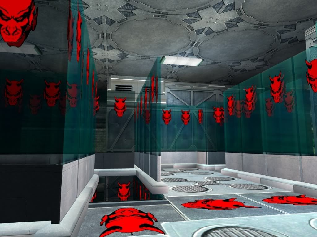
Entrance
This was my first foray into post i13 base building. My only real goal here was to create a modernish two story room. I'm relatively happy with the results.
A view of the room
The TV wall
Inside the lower level
Inside the upper level
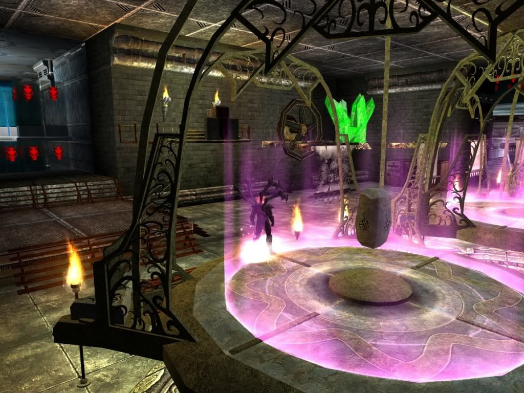
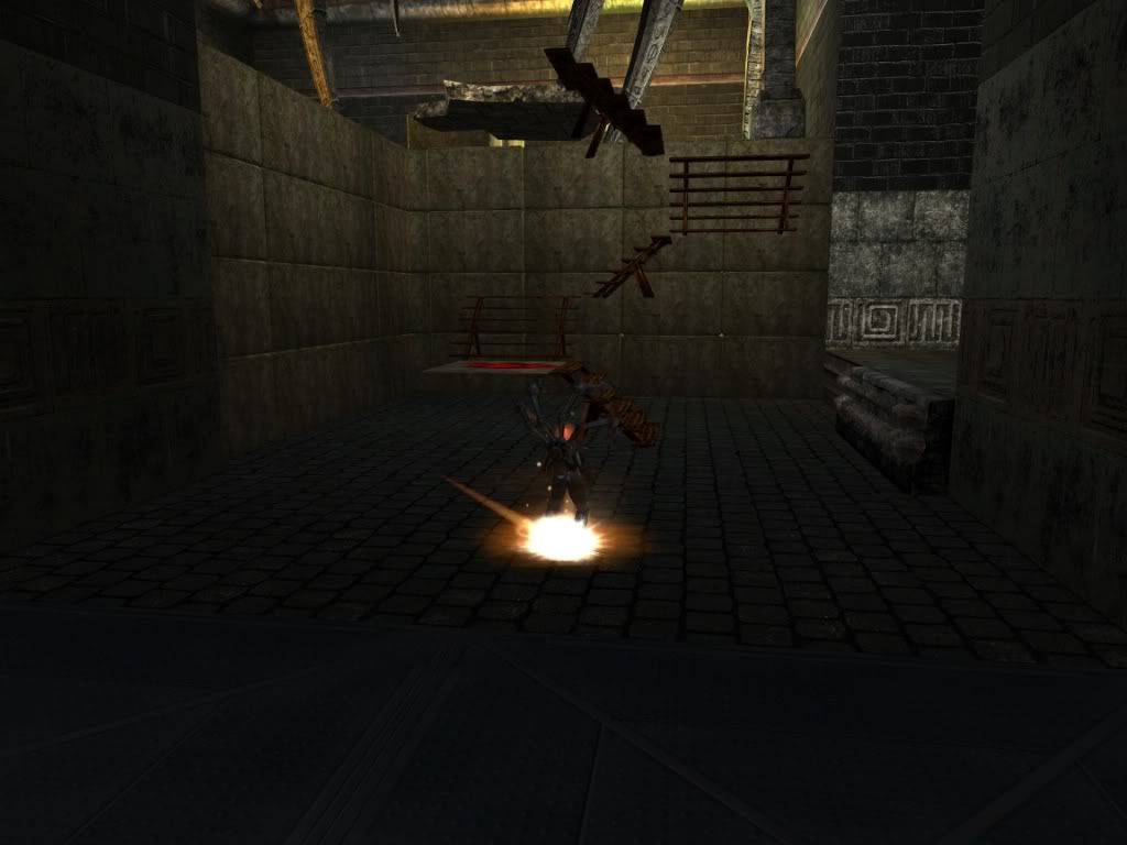
Teleporter room
This was the next room I did. The theme here is just a general arcane.
A view of the room
A view from one of the teleporters
Another view of the room
Medbay
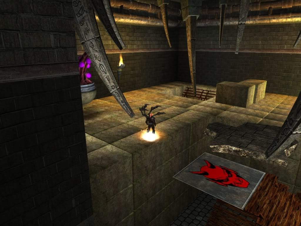
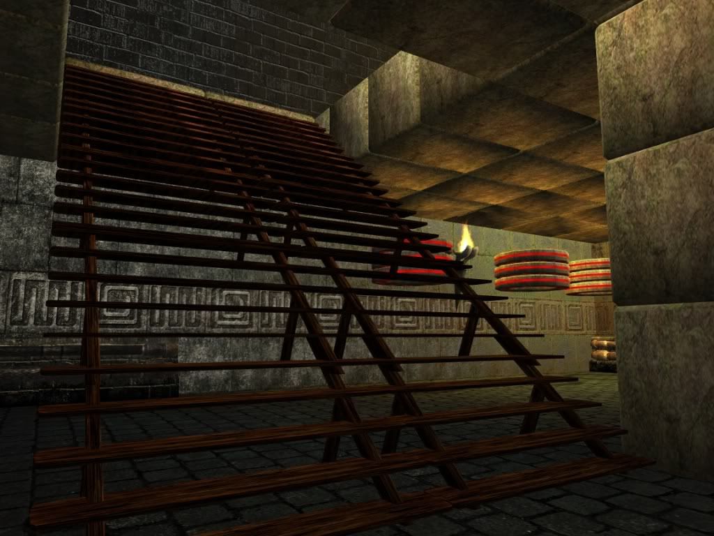
For my medbay, the goal was to create a simple mini-temple of sorts.
A view from the lower level
A view from the top
Another view from the top. Tried to create a portal in that arch.
Inside the "temple"
Workshop
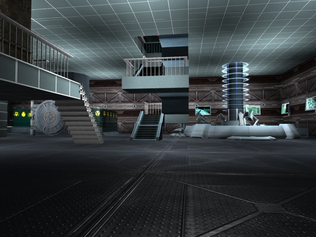
This is the room I'm most proud of. It started out as a space center, but it ended up as a lab/observatory
A view of the room
The far corner of the room
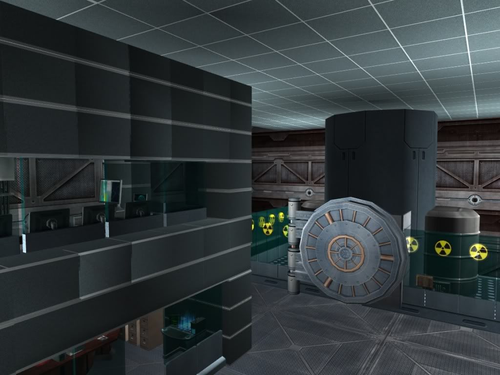
This was supposed to be a rocket, but it became a radioactive containment unit
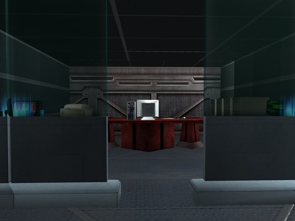
The executive office
Inside the control room
A shot of most of the viewing area of the observatory(the idea for this was inspired by Turbo_Starr's moonbase)
A shot of the stars
Another view looking out. Isn't that an amazing satellite?
Thanks for looking