
LadyJudgement
-
Posts
4230 -
Joined
-
Quote:No offense Foo, I meant only in that particular use of shadow. YOU have nothing to worry about.Originally Posted by The_Foo
 Augh, it's like a knife in my heart!
It's only cause we have the original pencil and finished inks to make that argument. IF you saw my pencils compared to my inks, you'd know I run rough shod over my lines! I'm one of those shorthand secretary pencilers, who knows what the INK is gonna look like. And I tend to do the same to my inks with my colors, but now that I FINALLY got the hang of color holds, I try to save all that detail I put into hair. I invented this hair brush just to ink hair the way I wanted it to be (digitally speaking), but before I knew how to use color holds, I would destroy all those ink lines with heavy coloring... it's the same argument. Why draw the detail if you're gonna cover it... -
This IS an art form, throwing parts together won't guarantee they'll be compatible, it's kind of like an organ donor waiting for 12 people to die. Though it's NOTHING like that! Still, I am very curious to learn the specs... that is if CR doesn't mind giving his secrets away. I used a site last Xmas to build mine. What a nightmare... parts in, parts not in, they shipped and ****** up the graphic cards, that's right 2, how do you mess up 2 cards? Anyway we had to re-package the whole thing, it was like putting Moses in the water, well if your basket is run by UPS.
Anyway it finally came back perfect but what an ordeal over just buying an off the shelf one. Which 8 months later is what my local Futureshop (Bestbuy owned, but a Canadian franchise) has... I mean specs wise. Everything is coming out now with a minimum of 3GB, because Vista eats a GB just to run. I've even seen 9 or 12 GB on the shelf!!! With double my HD and the latest graphic cards for the price I paid 11 months ago.
Hey I am very happy with my baby. Dual 9800 GTs, 500GB HD, and dual 19" monitors. Yet, I would sell her in a NYC minute for MORE improved specs, that I probably don't need. I run Everything on disgustingly high specs, and to see WoW run with such crispness, almost makes the game forgivable, if it's player base wasn't so stupid.
but I digress, good luck to Pyro, though from the looks of CRs rig, it looks like you're in the best hands! I'm gonna have to subscribe to this thread now... -
Hey what are the chances of a Canadian someone asking for art of a Canadian tank, with the same toon gender and AT as the artist who now lives in Canada, and in the very same province? Okay that was rhetorical, put your calculators down and go outside!


-
Quote:Threadjack: What does Maiden look like? My main isn't Canadian, but as I live in Ontario now, and LJ is an SS/INV tank, I sort of feel a kindred spirit with you... pm me a screen and I'll spot you a freebie of my choosing.Originally Posted by Arnabas
Great work here.
Man, I wish I could draw, or find someone who could draw my chars for me. I have 2 or 3 in particular that I'd love to have art for, but my stick-figures don't seem to do them justice. -
Sweet, just how far are you gonna customize this CR? Are you gonna add die cuts or resin molds? I've seen some sweet paint jobs that look like car finishes... Can't wait to see the finish, may I suggest one thing... a really BIG monitor, over 24" or two 20"s... also will you be using one of those awesome 1GB graphic cards, or SLI-ing it? How crazy will the HD be? A terrabyte? Minimum 4GBs of RAM no?
I love a good custom pc...
-
I would say it's less of a "pattern" which is not always repeated this much, but more of a border. Try image searching for "Celtic Borders", then it's just a matter of how large you want the border to be, and how often it will repeat in any direction. Good luck, would love to see the finish... Are you drawing this in Flash? Because you could import a pattern brush from Illustrator into Flash, and make it easier on yourself.
-
Inking itself is an artform. Black ink on white paper is a pure pure experience for an artist. It's finite. It's creating a bold statement. And if you take the time to make "thick to thin" your friend, it can be a zen like trance. Don't butcher the subtlety of the pencil line, enhance it with some power! Be bold, be delicate, be skillful, be confident. There are inkers who blotch the page like they're being electrocuted. But all that frenetic energy is subject appropriate, it can't define things perfectly like a balance of variations will allow.
I would study some line work you really enjoy, and break it down before you start. How much of the surface are curves, straight lines, repetitive, or erratic? A pattern will emerge, because this is how most artists draw. As an inker, you are not tracing their marks, you are finishing their thought, the question they had when they drew it to start with, that question is what all artists think as they create, "I wonder how this is gonna look when it's done?"
So is your finish ink a rush job? Do the shapes pop? Are the points, curves, bumps, convincing? Does metal feel smooth? Does hair feel in motion? Are the eyes focused?
A heavy hand doesn't care about any of this, they just want the whole thing to be dark... so they can color it already. Some colorists can't even be bothered with the ink stage, they just darken their pencils. Because to them the tedious, laborious task of defining that line, even the ones they may have created themselves, is too much work. So to be an inker, requires both passion and patience.The work will show if you loved it, or ignored it.
Cross hatching is the slow build up of markings to form grey tones. Film Noire inking is littered with patterns of light, and deep purposefully designed areas of shadow. Contour lines define nothing, but together they show grace, still the moment. And let's not forget the intentional splatter, that grunge texture to create mood.
These are the Inkers bag of tricks, much in the way the penciler has his definitive look, the way he draw muscles, women, machinery, tells a story. The Colorist also has their own; am I conveying realism or intensity? Mood and depth or detail and movement. They do this with saturations and color theories and combinations that they have either borrowed from a shared perspective (yellow bananas, blue water, green leaves) OR they are pushing your eyes to see light, shadow and form (red bananas, yellow water, black leaves)
A good inker should not make the penciler's work disappear, neither should a good colorist make all that time you took to ink something right, be made to seem pointless. Let's take an example of some talented teams of comic history...
John Byrne pencils, Terry Austin inks, sadly color back then was neither here nor there. Not like today, where you notice Lynn Varley's work on her husband Frank Miller's work. My point being, while Byrne could ink his own work, he never took the time Austin did to give all those extra details. Byrne's inks to me look rushed, and unfinished. Now Jim Lee's work is so distinctive, but Scott Williams or Sandra Hope his colorist, makes his work become three dimensional.
I happen to be a big Conan fan, and John Buscema was a definite master... but when John's work was inked by Alfredo Alcala (70-80s work for you younguns) there was no question that all that traditional LUSH brushwork made John's work better.
Pencilers are hot because of their style and storytelling. Inkers are hot because of their details and subtleties. Colorists are hot, when curves pop, muscles bulge, fire burns, and metal shines. I LOVE this medium, no other traditional medium (painting, sculpture, graphite) requires a team to get it right. Those are soloist concerns...
Our thing, this thing of ours, il comic cosa nostra... knows that it has a beginning, a middle and an end. Inking is the middle, the filling, the line that holds...
Okay off my poetic soapbox, keep up the good work! I have faith in you. Sorry for the wall of text everyone.
Bobby -
You can have mine... wait, what happens to the Lurkey if I over cook the yams.
-
Hey Ben:
Okay HERE's what I got...
1) The top is very basic, some of the black shapes were lost in the shadows. And even though the penciler drew it that way, as a colorist, those little white separations help define his original concept better in my opinion. Why draw the figure at all if you're just gonna throw parts in such heavy shadow. An example would be her back foot, and his front foot being on the edge of the roof top but the roof itself melding into their feet. It's sloppy I think, and just a slight white paint correction fixes that.
I did these digitally, a lot easier on me, and less cursing at you...
2) Here's where we get to the meat of the matter. If you study the original drawing, he sets an inking pattern that follows his concept of light. Dagger has a thicker outer line to define her form, separate her from the details inside the form, so your eye sees her right away, and doesn't get lost in all the shadows being the same weight.
That's the only thing wrong with this as I see, and it's an aesthetic, some people like heavy heavy blacks, some like less, and some a happy medium. The guy from the Massive Black video, likes greys. Which is why he uses that feathered brush pen to make his hairs. Not just to give the right texture, but to build up his greys into just the right tone. It gives three dimensionality to the skull and cheeks when hair is draw that way. Instead of a huge flat black shadow, for say mood. Again it's to each his own.
SO with that in mind, here's what I did.
I took a snippet of Dagger from your finished Ink, I "grey" it out to allow me to re-ink her, and I started with a heavy outline with my heaviest lines on the left to indicate the light source on the right. That is the top row.
On the bottom row to the middle, I filled in with thinner lines to show detail, your heavy hand chopped off the right ear, gave her a giant right eye ball, and lost her right earring. I put them back in. I studied the original drawing again to see which parts he still wanted black to stand out. And again he indicated light, and subtle differences, like the crescent over her eye is heavier than her eye brows.
I would have used the same effect for her hands, but all of those separations could be done in color holds, so there you are fine. You could have drawn her hands and fingers with your thinnest point, to indicate intense light.
In the final frame on the lower right, I add my own aesthetic "flourishes", things the original penciler didn't indicate, but as an artist, I wanted to put in, to differentiate that I inked this over someone else. I would NEVER do that on professional work, but on my own, I would at the last moment, instead of drawing all those flourishes out.
Hope that helps. Again, nothing wrong with your piece, just some things to look out for, and I would use as many subtle varieties in line as you can get away with, if you really want to spend the time. At the last moment, I thought the inside of her hair was still too thick, so I lowered the line weight again... Thank God for Adobe Illustrator. I would hate to ink traditionally, even though I use to, and loved it... It's just so much easier to do it digitally... for me.
Keep up the great work!
LJ -
Quote:I should think HE would be hiding today of all days...Originally Posted by VexXxa
I can't think of a better person to start the gobble thread! Good job Turkey Lurkeyyyyy!!!!
-
Swansy: I'll do a Photoshop side by side and circle in red some points of discussion. I partially agree with what Pyro said, a lot is lost in the coloring. Btw that's a great demo to watch, I love Concept Art.org and Massive Black's downloads are so affordable considering all you learn... I've actually watched that WHOLE thing. The only thing is, that guy inks like an old style brush artist, and not so much like a traditional comic artist. So I'm not sure which style you prefer, or if you want to merge them...
By the way did you ink your piece by hand or digitally?
NOTE to Eddy: I'm not even on coffee yet, and I taped the Parade so I could relive the times I use to freeze watching it from the streets. So it may be a while before you get my full crit. -
Quote:Png file, takes on the color around it, well if you trim it nice...Originally Posted by David Nakayama
Hey, check out that avatar! Haven't seen anyone do it like that before--nice!

-
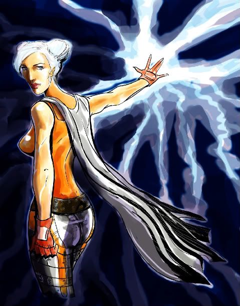
Well that's this Fire/Storm toon's name... Click image to see the larger DA version.
-
Yer welcome Gray! Sorry CR, it's the kind of thing I never think to do, cause I figure who wants to draw my toon? Even I don't draw her that much... but Gray insisted, so I aims to please my patron.
-
Quote:Originally Posted by Juggertha
I'm glad ya did this. I actually had trouble finding references of your character when I drew her.
It's an easy enough costume to replicate in the CC:
Head with masks, diablo mask, double eye plates, glam hair.
Chest is excess pattern, full gloves, sharp pattern.
Lower torso the same, excess pattern, thigh high boots, sharp pattern.
I added the shattered scarf as "webs", and the 3 shoulder spikes.
Her aura is lightning eyes, on fairly dark grey.
Someone on DA commented that the pics were taken by my stalker.
-
Gray Huntress asked me to take some screens, and I am horribly late with it, so here they are all together in one piece...
Also this is basically for other artists to use as reference. -
Whoa, when Windy walks, I suddenly feel the urge to throw money at her... em/pole dancing... that's a hot toony ya got there!
-
I "LEARN" so much from these, thank you for sharing them all... someone sticky the thread!
-
You realize this is a family game right? I mean I have no problem with it... but I'm sure a Mod will.
-
Enjoy college, come back when Going Rogue comes out... will be worth it then. Nice to have met you...
-
That Omi blue robot piece is stunning. The shadow on the arm and shoulder, the background, the sheens... beautiful job! Congrats.
-
Quote:WHOA! I just got Nakayama'ed!Originally Posted by David Nakayama
Lookin' good-keep it up!
 Thank you sir, I will!
-
-
It's a wee bit sloppy, but I likes the face! lol tanx DE!
-
