-
Posts
743 -
Joined
-

Statesmango
The reason they call it Devouring Earth.
-
1. Liz
2. DD
3. CR
Altogether now: Noooooo!!!
-
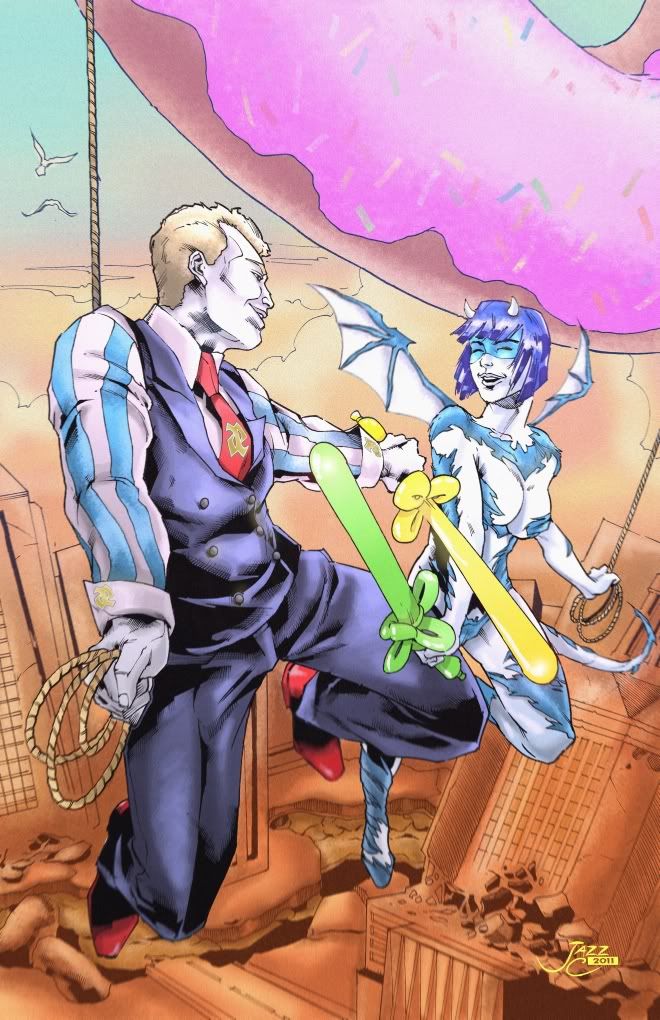
Oh my goodness, that's amazing! Jazz has the most stunning colour schemes. Seeing these guys mucking about over a scene of monstrous destruction is spot on for Airhead, and I bet for Gorm Diabhal too. I had imagined them standing on the buckets tied to the end of those ropes, but this is far more blithe! Of the 'blithering idiot' variety. The fabric outfit is done brilliantly. They both look so happy, like me right now. I am glad the doughnut is pink, so the balloons aren't.
I'm so sorry for not finding this earlier, my access on holiday this week in Iceland (land like Ouro crystals!) is sporadic.
Thank you so much Caemgen, you are truly generous. This is inspiring. I will definitely be leaping back into commissioning in a few weeks. And thank you Jazz, you have so much talent! -
Love that style! Such round... boots. The colours are amazing. Very versatile result too, you could make greeting cards or a poster.
Fenian Wolf looks utterly besotted. -
This is awesome. Pun chi. Dynamism, personalities, composition... more City of Ponies please!
-
Great gets!
I like Syn Apsis as the coolest art, the attitude, lightning and jeans, but Mdula is my favorite concept. I really like the leaf.
Not sure if the Victorian Decor aura can be on just the chest, might make an unusual leaf.
Game definitely needs spears. -
This is looking good!
In line with the suggestion to use colour for fast reference, perhaps you could use orange to outline hostiles, like you did the Rikti Drone. I liked the look of that, but I understand you wouldn't want to eliminate all the detail in view. Perhaps highlight 'soft spots' on the target, maybe coloured for usefulness. Immobilize, kill...
Mostly red is good. I can understand Arachnos wanting to keep things "black and white", so having a red palette should reduce the chances of them humanising the objects they see.
I agree it is possible to sneak up on one of these guys, so perhaps 360 degrees is too much.
The comm voiceprint (white) is the most visible object in the picture. I would imagine that should be the hostiles.
The predator stuff is nice. For Arachnosness, perhaps the objects in view could be linked (web-like), such as the suggested order of engagement of the hostiles. Or equipment icons of the hostiles could be arrayed around it, that might look web-like. I imagine perhaps the view somehow could present the targets as being caught in a web already, awaiting feeding time... but I don't have a simple way to project that. -
Quote:Hah! That could so be me. I wasn't willing submit my doodle-of-a-Rikti-monkey poster thumbnail (you know y'all wanted to see it), only a finished poster, because of my ego, and yet thusly I failed, because I'm working around the clock in a quaint little country south of Canada (this week) while double-tasking my other day job in Singapore."No, you're not allowed to leave. You're a coward and you're wrong."
I love BW's art. I'll follow it where it may go. I'm also happy with DD winning this round.
CONGRATULATIONS DD AND BW!!! Winners all 'round. -
Quote:I am inclined to agree. Mainly to stay in character. I guess that's proof.Yeah! Anyone who doesn't agree with Suichiro is obviously an illiterate, boob obsessed moron who doesn't know a thing about art! And don't give any crap about differing tastes or opinions being valid, that's just proof you're a moron!!
(Oh and I was truly looking at the trailers, just tried to be funny in an earlier post. No doubt this one will be misunderstood too, but it goes with the handle). -
Quote:Navies use warship outlines to help them identify warships encountered at sea. So I figured trailer outlines are for trailer park rangers.Luckily I rated all the trailer outlines equal... So the fact I voted based solely on the art doesn't matter! (Having read none of the trailers, I find them all equally magnificent.)
Perhaps I better go back and re-read. -
Ahh, but DJ has all my points! That ought to be good for a narrow escape.
I don't think I had enough points to skip this month, only to get an extension. And real life hasn't been kind to my free time, I'd have failed even with an extension. Sorry about that. I had a script and a thumbnail but the poster would have been the most important bit. Might try drawing it when I next have a quiet month. -
Quote:Aye. Still on the road, now near the world's second-tallest building. I brought paper and pencil, but no scanner access until Wednesday. That's the soonest I could start colouring... and I still gotta draw. Not looking good for this month.Only a couple days left. Would be great if you can find the time to finish, Airhead, even if you need a "little extra time"?
And I had such a grandiose plan and script. Still looking forward to a few more entries this month! -
Is it a Rikti invasion, or is it ... a flyer with Bubble Trail aura? That's an awful lot of bombs... or some really weird physics.

-
I liked the old splash screen because I imagined the pile-o-heroes (with possible villains) had me in it somewhere.
Perhaps they can make it easy to switch out the splash screen, and I could even use a screen shot?
That bot looks a bit like Defender, though I'm probably not meant to say that. -
Quote:For me, it's mood. Layla creates these superbeings as if they're part of Layla (blue naked chick with pink hair) world. Layla also has a knack for figuring out how to caricature a hero within the constraints of the yarn doll. The eyes are always telling. Whether they're buttons, or cloth, they aren't going to be duplicative of human eyes, yet they're the most telling element of the face. Often the only element. Layla has a knack for getting this right. In the case of my Airhead, she chose white buttons but painted the insides grey. I have no idea where this comes from, I haven't seen it done before or since, but it makes more sense than anything else I can think of. Layla has a knack for personality in a minimalist solution.I'm curious if it's price point that made this round of plush dolls popular with the art forum crowd. A few of us have ventured into this realm before but nothing came of it like this.
That's just my point of view, as a very happy customer
-
Dang. I sense doom. I've been planning so much for a work trip that I haven't got started on my poster, and with 11 days to the deadline I'll be in six different cities. Worst part of it is not the likelihood of failure, but the likelihood of failing to be in the running for a Samuraiko trailer. Waaah!
(11 days! Get busy!) -
Amanda Vines
 is
is 
(Because Lara Logan is not an actress)
Airhead is...


Gurmit Singh! Uhuh, obscure. -
What is a battle without controversy?
I give my points to Defiance Jones
*ducks* -
Congratulations to Liz! And commiserations to Tartyrsause. Your art is always full of humour, I hope you can still toss in a submission when you have time.
Nice coloured graph Bubbawheat! You should colour self-votes in purple
I'm taking part because it forces me to take a break from work and try something different. I haven't submitted every month, and I've taken other shortcuts (apologies for the screenshots), as my work still has priority. So please remove my points from your "cumulative" graphs in future, they don't have meaning or motivate me in any way and I won't be using them as I can submit even if I'm "eliminated". Or I can spend them all at once on jellybeans if that is somehow easier. But I don't begrudge others using the points (or even voting for themselves), variety is the spice. -
While I think people will continue to use whatever criteria they like to figure out their votes, there's no doubt the scriptlet will influence some of the voting. As a script for a short trailer, your first priority would be to make it sound good enough to want to see. If you can write more than a paragraph without too-long-didn't read, great! A trailer usually ends in a cliff-hanger, so people will go see the film. Does a cliff-hanger make people want to see the trailer? Does the plot warrant more explanation in this forum? These and other art-critical issues may be answered in my very next posting!
-
-
Wow! Thank you so much Caemgen!
This is a great contest concept, a wonderful artist and a massive amount of generosity. I am looking forward very much to seeing the toons together. Great artists like Jazzcarmona always exceed my imagination.
And apologies to Mel, the doughnut was really tempting
-
1. BW
2. DJ
3. TS
I used to have a tarot deck, and I voted for the pictures that most reminded me of those days. But I have to add that Liz and Chris' pictures are the most beautiful.


