
Liquid
-
Posts
1185 -
Joined
-
I have an arguable one from Positron himself, who designed the Badge system in Issue 2:
The Brawler badge is part of the Freedom Phalanx Reserve Accolade, and refers to Back Alley Brawler in its text. The badges in this set appear to be intended to refer to Phalanx Members. Interestingly enough, there is no badge to represent Numina or Citadel, and instead, one represents Ms. Liberty. -
Quote:When you're talking about removing the only minority from the signature supergroup, yeah, it matters. I'd be saying the same thing about gender if people were asking for Sister Psyche and Numina to be written out.Originally Posted by BrandX
 So you're saying race matters?
 -
Look, I hate to be the one that brings this up, but you do realize that you're asking them to write the only minority out of the Phalanx, right? I mean, without him, the Phalanx is 100% white.
-
I thought all of the Surviving Eight that weren't Phalanx members got invited to the Phalanx after the Rikti War. I don't know why I thought that, but I thought it was part of the lore somewhere.
Personally, I think BAB should be a member of the Phalanx. It's not much of a retcon if everyone thought he was anyway, and if you don't want to retcon it, have him officially invited after the events of Issue 21 and the destruction of Galaxy City, which force him to come out of retirement.
But I say retcon it. It was retconned anyway in CoV with the stated missions, and nobody complained, so why not just accept it? -
Pancake everything, we're doing 5 shoulderpads!
-
Quote:You should have been here for Issue 3.Originally Posted by Olantern
My hope is that the devs don't take this positive response as a cue to, say, put the Fifth Column in metallic, purple armor.
-
I typed up a detailed list of things I liked and didn't like about the new designs, and the forum ate it with the logout bug. I'll try to give a shortened version.
I like these better than what you showed us before, but I still far prefer the original models for the Circle of Thorns. These look fantastic, but for many reasons still don't quite look like the CoT.
I like the color choices you made here (yes, that includes the Death Mage. Change the pink if you want, but please keep the purple). I like that the thorn pattern is not as pronounced on the Minion and the LT mages. I like that most of the color choices match the color scheme of the old versions of these mobs. I like that you attempted to provide robe-like stuff for everyone. I like that the minions appear to be faceless again, and have green glowing eyes. I like the Thorn Caster hats.
I do not like the degree of the spikes and extra shoulderpads. I feel it is too "extreme" and not something that fits this group. I don't like the fact that everyone shares the same pattern, but with different bolt-on parts. It looks too homogenous and feels like a custom AE group created out of a single costume set. The Boss mages look really amazingly awesome, but do not look like ancient wizards-- they look like alien overlords. The group really stands out against Orenbega, and doesn't look like they belong there-- Orenbega looks like an ancient civilization, and they look, just as you describe them, modern.
Thank you for the changes that you have made. I don't expect that you'll ever consider just updating the textures on the old models, but please be aware that I still would far prefer that to this for the CoT, and would prefer that these were some alternate dimensional version of the CoT. -
Quote:So are non-reflective versions of reflective parts on the table for that theoretical toggle you discussed for legacy parts? As I mentioned in the All Things Art thread, I'm generally not a fan of the reflective parts due to the discoloration the reflections cause. It's cool tech but I have trouble using them on some of my characters due to it messing up my color choices.Originally Posted by Noble Savage
Given the choice between a measured amount of reflectivity on metal and none at all, we've of course chosen the more visually impressive and modern option. Over time, we'll have to reconcile that decision with the older parts, but that's part of ongoing development. Work in progress.
-
Quote:I just want to point out that I never said she shouldn't use any valkyrie armor parts. I just don't think they should be the focus. I can't really say that I like your particular example, but the idea of using some of the parts is fine.Originally Posted by FlashToo
Crosspost from a different thread, where I posted a counterpoint to someone's explaining that Valkyrie should not use any Valkyrie armor parts because they don't look techy enough:
-
Quote:I want a motorcycle, and have since release.Originally Posted by Noble Savage
The most interesting thing for me, reading all of this talk about iceslides, is that the idea seems to have a surprising amount of support. Would all of you really want an iceslide before, say, other flying platforms, some kind of mount, etc.? Let us know what you're dying to see in game!
But I won't buy it if it's going to shut off all my defensive powers and result in me being slaughtered by the mobs I drive by. I don't mind not being able to activate new powers, but shutting off toggles and passives is a deal breaker. I know the tech for allowing this probably doesn't currently exist, but I think it would be a good idea to create it.
I know that's not your area, but I want the others to know that this is important if they want to make money off of selling vehicle powers. -
Hurrah! Glad to see a new Dev Choice arc! Congrats, New Age Ronin!
-
Quote:Originally Posted by AzureSkyCiel
Problem: The Valk pack wings don't have a "with headband" option the lowres ones do.
Yes. I've got a valkyrie character (whom I have a framed David Nakayama sketch of on my wall above my computer), and that's the only reason I use the old wings. The new wings look AWESOME, but don't have that headband/tiara with earplates piece. It looks like she's got metal wings growing out of her head if I use them. -
Quote:I agree with you on this point.Originally Posted by OminousVoice
True, she should reflect her origin and look techy, but there's hi-tech, lo-tech and then there's the current Valkyrie which looks more like a cheap halloween costume than battle armour.
If they want to make fancy versions of the existing valkyrie parts that do look techy, that would be cool, but if they're going to use standard costume creator parts, I think she should look like she's wearing a suit of technological armor, which is why I prefer Techbot's suggestion over yours. I think it's the most important aspect of her costume, otherwise her original version probably would have used the medieval armor parts. -
While I can see your point about mismatched parts, honestly, I prefer Techbot's version. I know nanites mean the armor could be smooth, but Valkyrie has always looked techy, and she should continue to look that way. It's part of her identity. Overuse of the valkyrie parts just make her look like a generic valkyrie.
-
Quote:I think it sounds awesome. This is the kind of graphical update I'd like to see. My apologies for assuming it would be a radical redesign instead of improvements to the existing concept to make it seem more alive.Originally Posted by Noble Savage
For me, changes like these would simply be polish on the core experience, deepening the encounter's sense of immersion and realism and keeping the art fresh and modern. This is a living game after all, and ideally we want the graphics to impress both new players that decide to try us out for the first time while simultaneously keeping things fresh for the veterans. I don't think any of the hypothetical updates listed above would harm the Hamidon experience. In fact, I think they could take what's already cool and make it way, way cooler. What do you think?
-
Quote:This is a great point, and something that I wish I'd thought to say.Originally Posted by Redlynne
And even more importantly, Primal Hamidon is a "giant monster" you have to get into in order to fight and defeat. Everything else in the game, you have to fight from the OUTSIDE ... while fighting Primal Hamidon, you have to fight from the INSIDE! No other challenge/opponent in the game requires you to move inside of them in order to fight them.
I'm also glad they put Hamidon in the LGTF, because it allowed more people to experience such a unique enemy.
Changes like this I would be all for.Quote:Originally Posted by Zamuel
There are two visual changes that would aid Hamidon. One is just the general transparency adjustments and resolution adjustments. The other is similar to what I mentioned with Hydra and Lusca in making the nucleous, mitos, and outer membrane have more of a waver/breath/pulse that makes them feel more alive. -
Quote:Hey, that's cool, all of that sounds fine to me except for changing it to a giant Ent or the landscape.Originally Posted by Calibre
Oh. Didn't know we were on opposite sides of the fence on this topic. Sorry, didn't read too much into this.
And it's fine that we disagree on that. I just wanted to know why. -
Quote:Killer Frost is a DC character that uses an ice slide.Originally Posted by Attache
With ice slide being utilized by Iceman and Frozone in The Incredibles, I'd guess that if you can find any other characters at DC or some of the independants that have utilized the power, it should be safe enough to do something similar with a CoX spin.
-
Quote:That's something I wondered about too. I've never heard the word "static" used to criticize the art assets of Hamidon, just the gameplay aspects of him. Perhaps I'm misunderstanding the usage of the word, but it seems like a weird statement to make about art assets. Wouldn't every NPC in the game have static art assets, aside from auras?Originally Posted by StratoNexus
Is he too static? I would say yes. That is not an art issue though, but instead a game mechanic concern.
-
Quote:I have to wonder if we're not using the word "design" to mean different things (it certainly is a vague word).Originally Posted by Calibre
Get rid of the original design...revamp/rupgrade it. SERIOUSLY. Not only does it /look/ dated, but it looks thrown together---like no one really cared what it looked like by the time the coding was done. Yuck.
Stick it in an Oro mish and be done with it once and for all. Please.
Cal
Just so David understands why I think it's great and you think it's horrible, do you not like the fact that it is a giant amoeba? Is it the colors? Is it the generally smooth, spherical nature of the Mitochondria?
I don't expect us to agree, I just want to know why you feel it was thrown together. -
Quote:It's a giant amoeba. It's a sci-fi apocalypse-causing monster of a simple and elegant nature. There is no simpler cell-based organism than an amoeba, yet it threatens the entire planet. There's something interesting about that.Originally Posted by Noble Savage
Relax--no immediate plans for primal Hamidon. And even if we were going to redo it, I'm sure the giant amoeba aspect would be retained even more than we did on the Praetorian aspects of Hamidon.
But now I'm really curious--tell us more about why you like it. Essentially all the players I talk to seem to find the art on that charcter a little too plain and static, and the posts I've seen in this thread rarely mention the original Hamidon among their favorite designs. Let us know why it's awesome. That's what this thread is all about--what resonates with you and why.
I also agree with Arilou about the colors. The bright and varied colors are unusual for a giant monster, but that only adds to its uniqueness.
If you want to update the art assets on it-- make the Nucleus, the Mitochondria, and the goo fancier looking or something, that's cool (but be careful, graphic lag is already an issue for many people in that raid). But please don't make it "evolve" to the point that it is no longer an amoeba.
That's my answer as it pertains to Hamidon himself.
However, this reaction of mine really isn't just about Hamidon. If you had made this comment ("That's one I'd like to get my hands on for a update") about pretty much any NPC in the game that was there at release, I would have had the same reaction: please don't change their general design. Updating their art assets to be higher res is great, but please don't change who they are.
I have a fondness for this world that is similar to the fondness I have for Marvel and DC, and the characters and groups are the reason for that. This world now has a history filled with groups and beings that feel iconic to me. For most of these groups and beings, it feels like they fill a need in the universe-- an archetypical niche that must be filled. Alter them too much, or remove them, and it feels like there is a void (see the removal of the 5th Column-- we no longer had Nazis in the game, and the Council were a pale, watered down replacement, both in lore and graphically). Characters change and evolve, and this is understandable and often good, but if they ever change too much, people who love them get upset. Electric Blue Superman is the perfect example. The design was really cool, but he wasn't Superman anymore.
The original design of this game, in both the writing and the art direction, was high quality. I know that the technical aspects are certainly out of date, but there was great attention to detail in most of the NPCs that existed at release, in both lore and visual design. If you want to make alternate universe versions of Nemesis, the Clockwork King, and Dr. Vahzilok that look radically different than their primal counterparts, that's awesome, and I look forward to what you would do with them. If you want to update their textures to be higher res, but maintain the current design, that, too, is awesome. But I'd rather the established characters retain their current designs rather than undergo anything close to a reimagining.
If you want to know what resonates with me and why about the various NPCs in this game, I could continue to post about each group and character in it. That's going to be a lot of work, though. It would be easier to talk about the ones that don't resonate with me.
-
Quote:Those two new Hamidon entities are very cool, but please, please don't remove the only giant amoeba from the game. It's too cool.Originally Posted by Noble Savage
That's one I'd like to get my hands on for a update. The Avatar and Seed of Hamidon seem to be going over pretty well, so it'd be interesting to see how we could evolve the original.
-
Back Alley Brawler is probably my favorite member of the Phalanx. This is somewhat unusual for me, as I'm a big fan of tights, masks, and capes, and he has none of these. However, I like him in all aspects-- design, concept, and background. Jeans and a tank-top just fit who he is.
Statesman, as much as his persona in the comics has poisoned me against him, has a good classic patriotic superhero costume. The only way it could be improved is if the helmet was a full helmet instead of that weird faceplate.
Synapse has a good costume. It implies speed with the blue and red blend (blue and red shifts come to mind), and the goggles and pads seem like something a speedster might need. The chest symbol doesn't really mean anything to me, though that may be due to ignorance of neurological images.
Captain Mako looks exactly as he should. He's a humanoid shark, and you can't really beat the simplicity of his design for that purpose.
Ghost Widow is the most intriguing of all the signature characters, though I can't really say that it's due to her costume. It does look fantastic, though. The waist cape and the shiny outfit help make her look both sinister and attractive. She's mysterious and graceful looking.
Dr. Vahzilok is CREEPY. I remember when I first saw him, I thought he was some kind of Frankenstein's monster. Then I was able to get a closer look in a screenshot and saw that he is wearing a giant meat-suit! So creepy and awesome.
The Clockwork King is classic. The Brain-in-a-jar + clockwork body combination couldn't be better for him.
Nemesis was totally unique and new to me when I first saw him (or at least, his Fake). The idea of a steam-powered robot designed to look like the man that created them is so cool, and the detail on the model is fantastic. Just look at it:
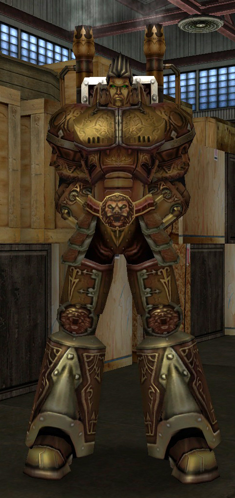
Don't forget his bizarre, beautiful, and interesting weapon.
If I had to pick a favorite, Nemesis would be it, hands down. I think he's the best designed signature character in the game.
But, if you're looking for input on designing new signature characters, I'd really like to see more classic tights/mask/cape types. I feel like we've got a lot of variety, but I'd like to see more classic superhero costumes on some new signature characters. I don't feel like we have that many, and this is a superhero game, after all. -
Quote:I said this to my girlfriend, and she responded with, "that would just be mean". And you know, after the playerbase liked him so much, it would feel a bit like adding insult to injury.Originally Posted by ClawsandEffect
6) The developer who used him as his redname alias no longer works for Paragon Studios. It is unlikely that anyone else will take up the mantle, and equally unlikely they will kill off a character being actively used as someone's redname. It also isn't too likely they will kill off one who has not been used yet.
Also, killing off not just the only prominent black guy, but the only prominent minority at all (Foreshadow isn't exactly prominent) is groan inducing. I think everything you've said makes sense, but I hope they don't choose BAB for those reasons, and because he's my favorite signature character on blue-side.
Regardless, I'm going to bet on Psyche being killed off and Manticore turning villain (at least for a while), only to come back later with Psyche in another body (wouldn't it be hilarious if it was Aurora again? lolz") ) and Manticore redeeming himself (with revamped character models and TFs). The fact that one picture has both of them in it, and the other one doesn't makes me wonder if they made a before and after image (somehow missing Manticore's quiver in the process), and sent out the wrong one.
) and Manticore redeeming himself (with revamped character models and TFs). The fact that one picture has both of them in it, and the other one doesn't makes me wonder if they made a before and after image (somehow missing Manticore's quiver in the process), and sent out the wrong one.
-
Quote:The Victoria MK VI costume code does not allow you to access it in the creator-- it gives you an inherent toggle power that changes your model into the Vicki model while toggled on. Check your Powers tab, on the right side for it, under "Inherent Powers". The icon is a white circle. Drag the icon into a power tray and activate it, and you'll look like a Vicki.Originally Posted by Star_Shaker
I have the Code for the Victoria MK VI, but, can't find it in the costume creator. Any help would be appreciated.