
LadyJudgement
-
Posts
4230 -
Joined
-
Thanks McBoo and Ben (that sounds like a detective sitcom from the 70s)...
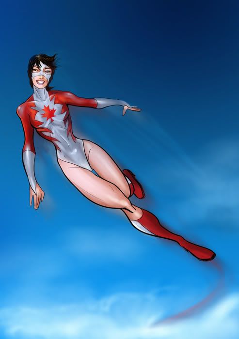
It was kind of rushed... drawn in Illustrator with no reference and I didn't flat at all. Since this is basically 5 color ranges (white, red, skin, hair and lips - not counting the sky) I just put them all on different layers. It would be slicker if I flatted, but I shaved off at least an hour by not flatting.
LJ -
Hope you like it Arnabas... pm me your addy and I will email you the original size (5K x 7K pixels)... click image for larger size.
LJ
-
yer saying the left eye curves on a frontal shot? cause on a 3/4 it makes sense as you would not see the whites... or is he drawing some people cross eyed, which i have not seen. And I agree with your placement of who's better, but in my opinion, the space between Benes and Turner is much shorter than the planet between Turner and Liefield.
Let's agree to disagree. I'm rubber you're Foo, whatever you says bounces off of me and foo's back at you.

-
No, I know Turner draws severely AND Benes draws similar... just like hmmm, Byrne and Lee draw similar women, men, etc... and I love Byrne and Lee. But all of that is part of their style. Are you telling me Huges doesn't draw similarly? He uses the same model all the time... it's part of his style in my opinion, much in the way Alex Ross photographs the same male model for Superman.
Liefield ignores any sense of consistency except being more and more inconsistent, that you can rely on. -
Milo Minara, hottest lips drawer eva... he should be rated X... for X-cellente!
-
Quote:Not a problem... hope they like it.Originally Posted by Samuel_Tow

One last detail - I'd like to repost this back to the original creators of the pic, and I want to ask of you would mind me doing so. We're sort of discussing it at length with them, and I'd really like to show them.
As to doing it twice in a day, well since the flatting stage fills all the shaped areas with color... there is a simple box to click in Photoshop, so that any coloring you do, happens in that shape.
This makes coloring go a lot faster than trying to remain within the lines and worrying about going over them...
BUT and this is where I stress the problem, the file must be prepared correctly, so that all areas are filled with a flat basic color so that they can be selected with the wand tool later. Failing to do this "flatting stage" properly, will only allow you to color where the color ends. So if you have gaps of white everywhere, you either fix the gaps or color the same spaces with the gaps still showing.
It's not the only way to color, you can go for a more painterly look regardless of shapes, I have done some speed paintings that way, which are more about mood and color than being exact. However standard comic coloring requires a flat stage for best results AND the possibility of making corrections simpler. -
Quote:Alas, I haven't been home since I was 4. Tried to in 1980, but it was not to be... I sent you a pm.Originally Posted by Arnabas
Ha! And also, your profile says you were born in Manila. My wife is from Pangasinan.

If you ever want to see Maiden Canada or her twin brother Northernguard, let me know. I'm also on Liberty and can meet you there. My wife is Canadian, part french, but mostly normal...
Nazghul1 - send me a screen, I may draw ya something quick... since that squishy line was pretty harsh. (insert heavy Scottish accent) I dunna want ye crying yourself ta sleep on your little squishy pilla... 
-
Quote:No I don't draw squishies... j/k.Originally Posted by Nazghul1
I have a Canadian blaster, does that get me free artz?

-
Quote:Originally Posted by The_Foo
Ed Benes scares me because I think he's going to slide into WTFville and end up with lopsided faces and weird art crutches like Michael Turner, or (to the nth degree) Rob Liefield.
He hasn't yet, but the style is very similar.
How can you mention Liefield in the same sentence as Benes and Turner. That's like saying John Byrne, Jim Lee and the animators of Ren & Stimpy belong in the same category... -
Very cool update, looking forward to the final spec list... I will have many, "why did you such and such..." questions. Be prepared for a press conference CR.
-
-
Here is the original line art, the original coloring (not by me) and the fixed flats WITH Samuel Tow's vector drawn sword and gauntlet, done in Flash.

Okay off to work on the rendering... sorry I edited her butt cheek, it was throwing the silhouette off in my opinion.
-
Quote:Knowing's half the battle, so I'm gonna need a link...Originally Posted by Hericane
And of course there's always the infamous Sister Psyche bubble bath page
-
I have NO probelm with the original drawing OR the color scheme, it's the WAY it was colored that another colorist, such as myself would find annoying as it wasn't done correctly. That's it plain and simple. Since I myself have made this mistake when I first learned to color, it came from 2 things. Not knowing what to do, and using a program not exactly designed to color more efficiently.
In basic terms - the black line has to sit on a layer above the flat base colors. This separation is crucial for two reasons. This way one is not mixed with the other, and both can be corrected if something needs to be changed.
But great that you have the original line work, I am drinking my coffee (sorry went to sleep at 7am) and will start flatting it to the original colors. I will try to match the shadows I made on the last one.
EDIT: Finished version started in another thread. Hope you like it... -
Well while were at it Ben: you could also use...
A brush pen marker and a few pens large than a 1 so you can color larger areas faster, just make sure they don't bleed through. And if you want that hair effect from the MB video, you'll need a second brush pen that you will have to cut into 3 or 4 times to make mutliple points. You COULD go waaay old school and use a # 1 Windsor & Newton Sable brush, a line art brush if they even make those still... there's more but that should do ya to start. Gees this feels like I'm teaching art again...
-
Well I tried shading it, but here's the problem, whoever colored the original line work, did not go to the edges of every separate shape. So what you have are jagged uncolored halos everywhere. Now you might just say, well couldn't you color those in... actually I could and had done all the blue areas, that took an HOUR!
This is because the person didn't do it right the first time. And I really don't feel like fixing their mistake. HOWEVER. It would be infinitely easier for me to recolor the black and white version, as I know what the heck I'm doing! SO, if you have that for me, my offer still stands, and I will use this color scheme to color in the figure, shaded and all.
But I'm not on the clean up AND coloring crew. Apologies but the only other way around this mess is a plug in I've never used and not sure how to use, OR re-inking the whole thing myself... that would be a pain.
Anyway here as I said was as far as I got...

Send me the linework, and I CAN and WILL fix it. But otherwise, good luck, and breathe deeply...
LJ -
Quote:Okay here's what I got:Originally Posted by LadyJudgement
I'll critique this with images tomorrow, I'm in food coma from this weekend right now... let me just say it's a BIG improvement.
Your original is in the upper left, the first version is in the lower left, and the free style version is the big one... Basically I think you need to get yourself 3 sets of pens, a #1 for your thickest lines, ie outlines of the overall figure, outlines of the individual elements, ie the hair, etc... then a # .05 or half whatever the one is, and use that for interior details, like muscle and bone lines, costume separations, etc... lastly you need a # .001 or .005, the superest finest point you can fine, the kind of point you could stick in a fly's face and he'll say "would you get that cannon out of my grill!" That pen is for your eyes, your lip details, etc...
With that in mind, I separated 3 areas of your original that I thought could use it, and blended too much with the overall line weight. I did this to the hair, the emblem and the sash. I also augmented the face a bit, as per Caemgen's suggestion.
Finally the big version, where I went to town. Your marker version is very nice, but using the same approach overall makes you think she's made of metal. When in fact you have a lot of fleshy meaty curves here that could use a bit of oomph! That's the beauty of those little cross hatchings...
They give the viewer's eye a nice delicate break from that bold black! Practice some more of that, and push it, I think you'll get the hang of it, but don't shy or avoid it, the penciller uses them cause he knows they help define form AND texture... as an inker you have at your disposal that bold black ALL the time, which penciller's will frustrate themselves trying to recreate. Some do that " x " thing left for you, which is what I thought you were doing when I inked the big version, cause you left alot of stuff he had already placed in shadow as open to either color later or bold black sooner.
Yes you could differentiate the 3 areas I did in color or color holds, but even under those, you'd fine the thinner line helps to make your bolder ones POP! Anyway, hope that helps...
Bobby -
I like Ed Benes, but hey he's Brazilian, hot women are in his blood.
Link removed -Mod08 , yeesh he's good! -
I'll critique this with images tomorrow, I'm in food coma from this weekend right now... let me just say it's a BIG improvement.
-
Yeah I smooth out curves in Illustrator with a special tool, kind of looks like a pencil, but you can't draw with it. It just lessens the amount of nodes in a curve or straight line, depending on how you "wand" over the stroke, and the direction you go. I've used the bezer handles, but only when I have to... since I free hand, expand it all to resize and then raster at the end, the node count doesn't effect me for the size of the file, even though I work huge.
When I do work entirely vector for that second link, it is all about the pen tool for as many straight edges as I need. But they have taken my digital vector "inks"... I like coloring in vector, but it's not my favorite thing, and I have NO patience for meshing, which my wife is the Queen of... ( check out one of her vector meshes )
If you like I could photoshop shade your friend's piece, with a high left of center light source. It's practically a "flat", and wouldn't take more than an hour. You could use it then as a guide... -
17,268 people have looked at this thread, and it has 174 comments or posts... that has to be a record!
-
Well when I did play continually, I played with a very good close knit group my very first year on Virtue. And when Kilo, Crescent, Alex, Larissa, Kheprera, Spinomania Turboski, and Cosmic were on Liberty, I had a great year playing with a dozen or so of the Envisionaries, as well as many people from this forum.
Not the same experience on WoW where my mage got spammed for teleports and every idiot and his mother wanted to duel. I hate that about Champions, not being a PVP gamer, it's wasted on me. Since Wentworth's opened, I rarely get hit up for influence, about the most attention getting spam I get is during a costume contest... but then it's to be expected. I like that this game is very different from WoW, this game spoiled me for WoW, and I look forward to Ultra Mode.
I tried LOTR for a little while, and it was beautiful, but I couldn't get all my friends to migrate there, as 2 of them were set in their Macs, and didn't want to bootcamp or run parallels or vm fusion. I am looking forward to Star Trek Online, and Star Wars the Old Republic... but COH will always be my home.
Edit: those tanks and empaths you played with, must be a few WoW players straying because it's Stupid Tuesday Patch day for them.
-
Quote:Pish posh! In the words of Leonard McCoy, "Damn it LJ! I'm a colorist! Not an Inker!" Fix whatever you think needs fixing in the color stages, this was just an experiment anyway...Originally Posted by Eddy_Swan
heh yeah I could have been a little lighter handed on that :P thanks for chiming in! I'll tweak that in photoshop
-
Ah okay. Well this is where you lost me. First off, I'm well aware of the difference between vectors and raster. Here is a raster coloring done in photoshop of my original pencil drawing, and here is the vector I made of the same drawing when I first learned to use Illustrator.
That said, what I'm thrown off by is your usage of Flash, while "vector capable" it's primarily an animation program. Illustrator IS a vector program. You should download a 30 day trial and play around with it... I haven't used Flash in a while, this was my sad little attempt about a year ago on my old pc. But my point is, programs like Corel Draw do showcase vectors, but the industry standard and a far more intuitive approach is found in Illustrator. It is worth using, nuff said.
If I may, when you get to the shading, stay consistent.
If your light source is from the left, keep it on the left on every possible surface it can hit. This means most or more of your shadows will be on the right. Your sword and glove has a light source from the left center, this allows for a deeper shadow on the right, and rim lighting or lesser light and shadow on the left. Your bright shiny sparkling effects or main highlights will always be left of center.
Check out these two Cosplayers I found on DA: Dark Warrior and Kasumi. I went hunting for a pose that would match your figure. In both cases the light is from the left, and the shadows fall to the right edges of her body.
Things to keep in mind the brightest colors are again left of center here, and although Kasumi has her face in shadow on the left, that is partially caused by the hair over her eye. The highlights on her face correspond with how light is traveling up her center line, which lines up - check the highlight: center of chest, center of neck, center of lower cheek.
In the case of folds, see how the white highlights on her sash are on top, and the shadows are below them, this is because the light is slightly high, in the the case of DW the light is coming from below.
Good luck with Flash, no use in you starting over in another program, but when you can try Illustrator. I use it to ink... in vectors, and then I raster those, and color in Photoshop. ( Original drawings provided by Starwind! )
Hope those references help.
LJ
EDIT: by the way, the gauntlet and sword are coming out great... are you using a mouse or a tablet? Cause I "get" the tedious part if you're using a mouse... -
So you're doing a kind of Photo-manip to "collage" this together? And why Flash? Is this for a website, or that's the only program you know? Are using...


